
Introduction
Red interior design is one of the most powerful and emotionally charged approaches in home styling. When used with intention, red transforms a space from ordinary to unforgettable. It can feel dramatic, romantic, modern, traditional, or even minimalist depending on tone, balance, and material pairing.
In my experience designing statement spaces, red works best when treated as a strategic design tool rather than simply a color choice. From deep burgundy walls to subtle crimson accents, red interior design thrives on contrast, texture, and thoughtful layering. When properly executed, it adds warmth, depth, and undeniable personality to any room.
Below are expertly structured clusters that explore red interior design from every meaningful angle.
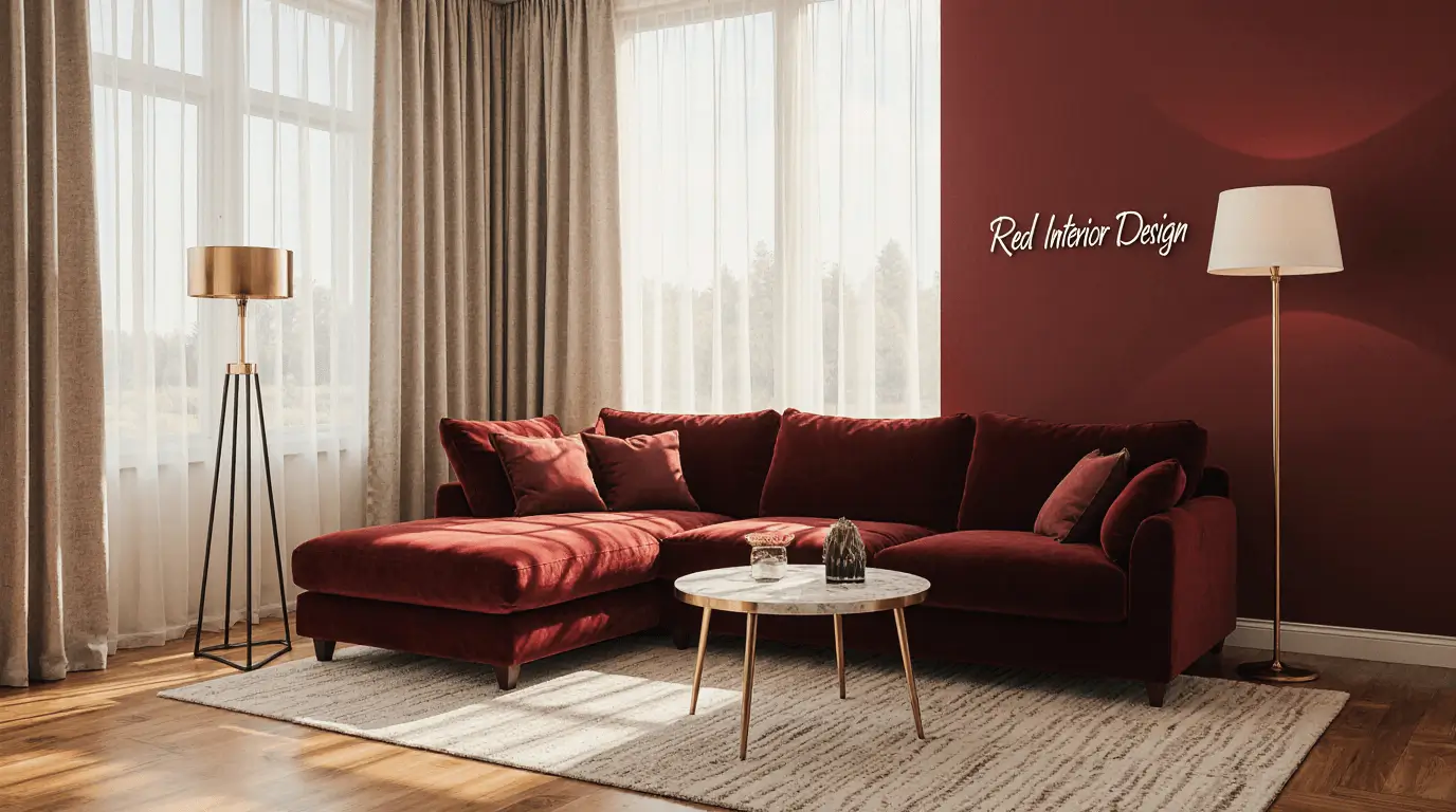
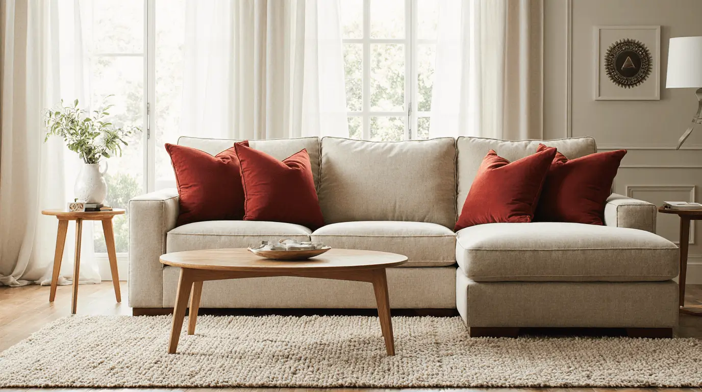
Red Interior Design in Living Rooms
Red interior design in living spaces creates energy and conversation. Whether through a statement wall or plush velvet seating, red brings warmth and vitality.
Balancing red with neutral flooring and layered lighting prevents visual overwhelm while maintaining bold character.
Modern Red Interior Design Concepts
Modern red interior design leans toward clean lines and controlled saturation. Think matte finishes, structured furniture, and minimal clutter.
Pairing red with black, white, or concrete textures enhances sophistication and architectural clarity.
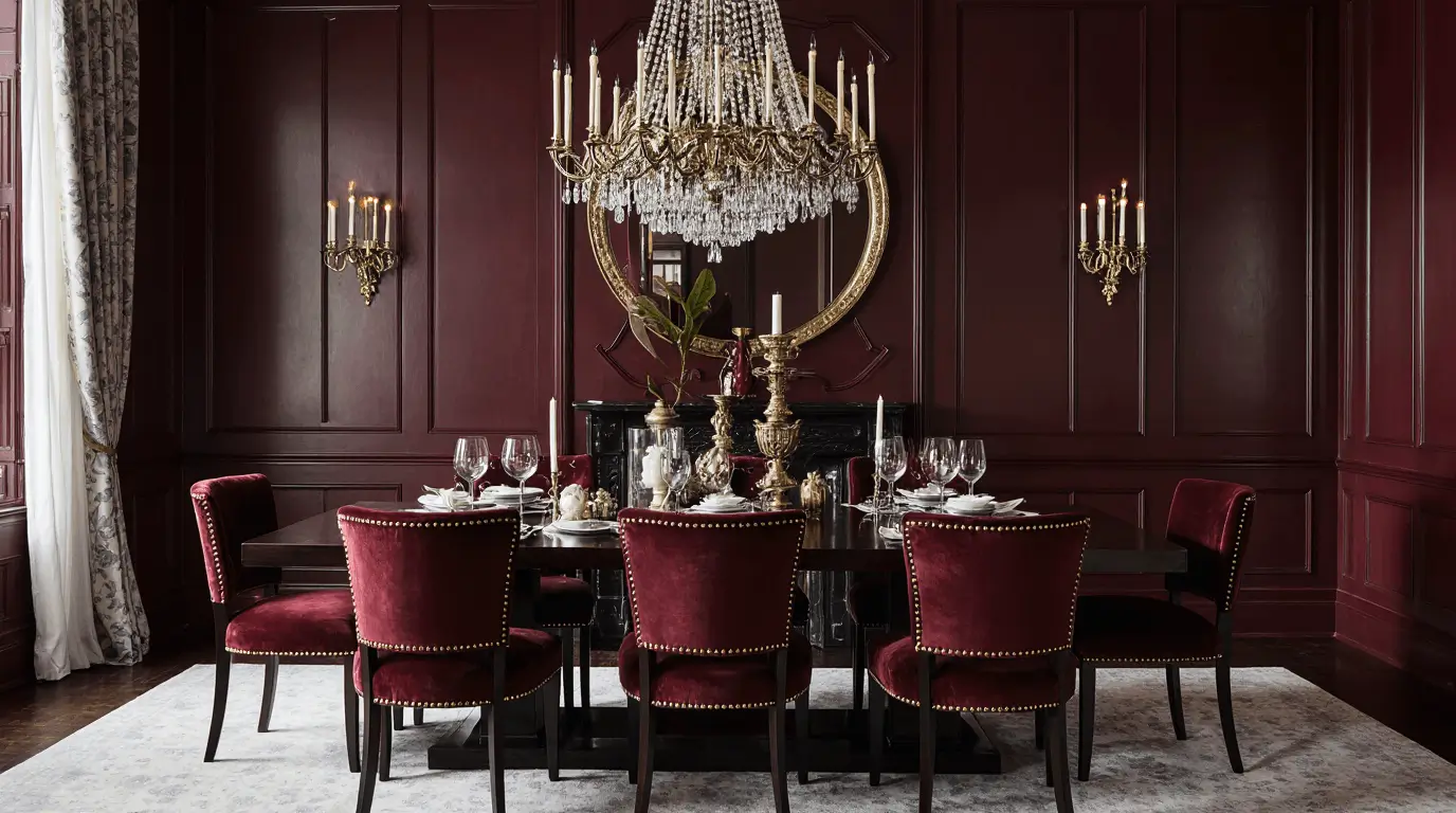
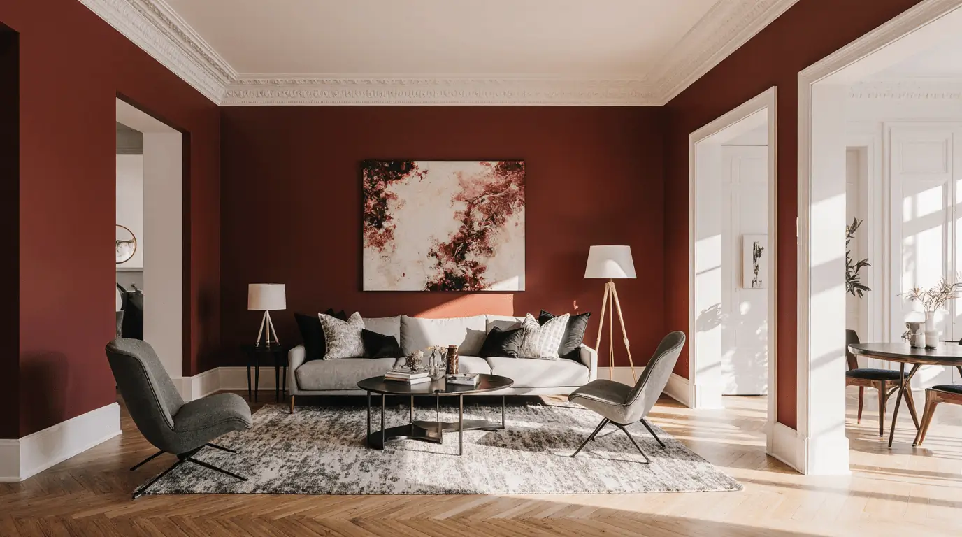
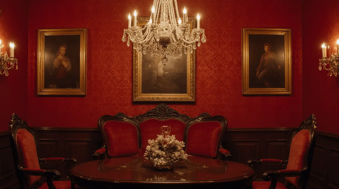
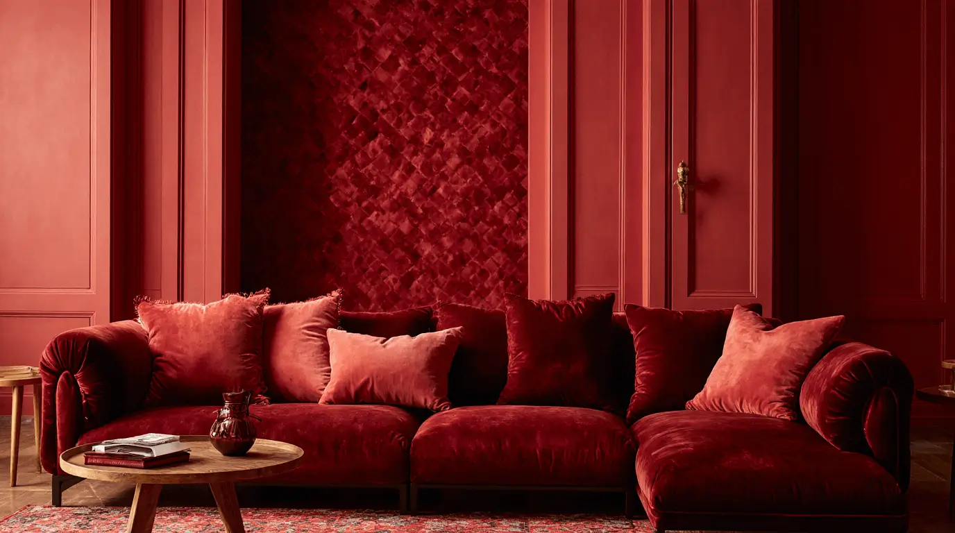
Dark Red Interior Design for Dramatic Spaces
Dark red interior design—such as burgundy, oxblood, or wine—creates intimacy and depth. These tones work beautifully in dining rooms, libraries, and bedrooms.
They absorb light softly, making the room feel grounded and luxurious.
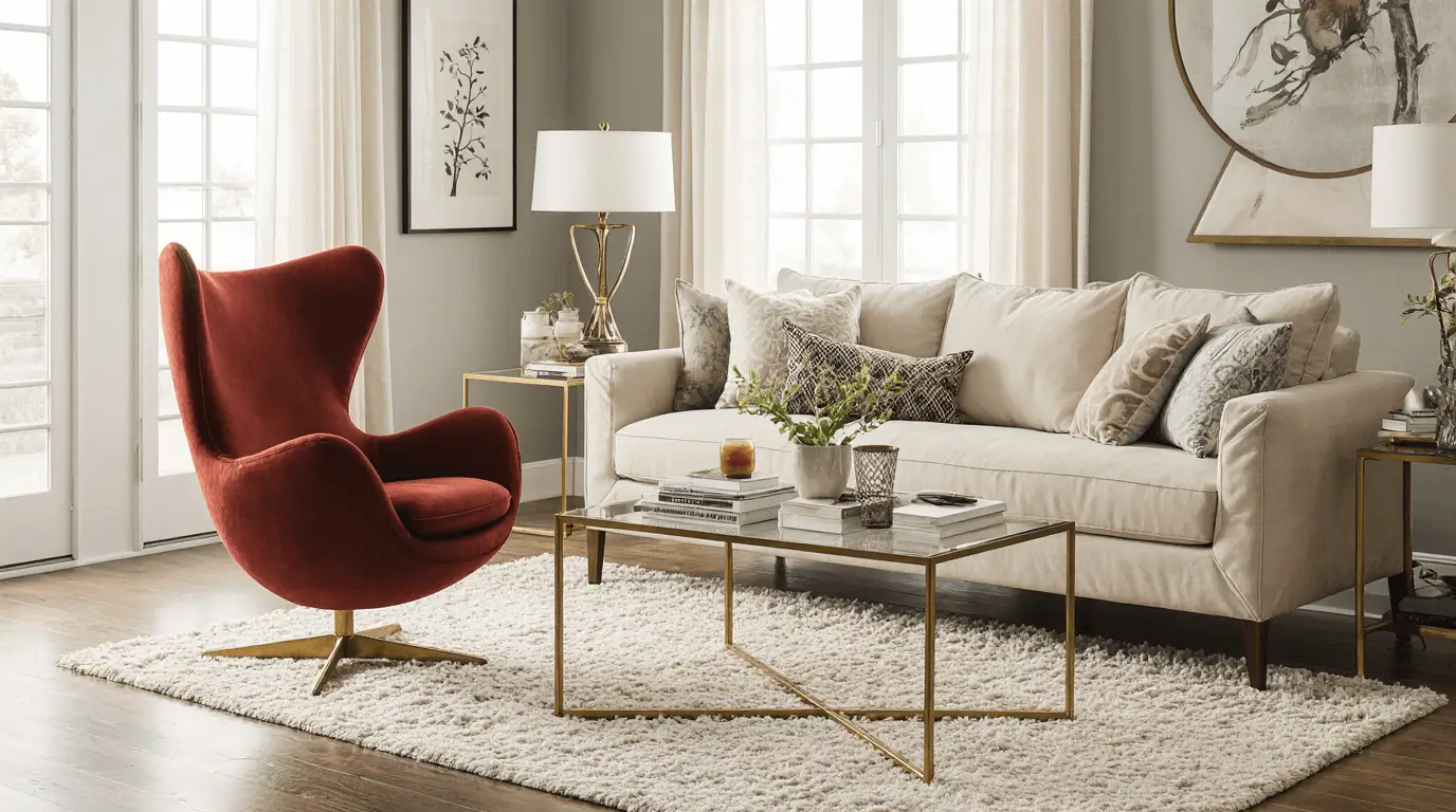
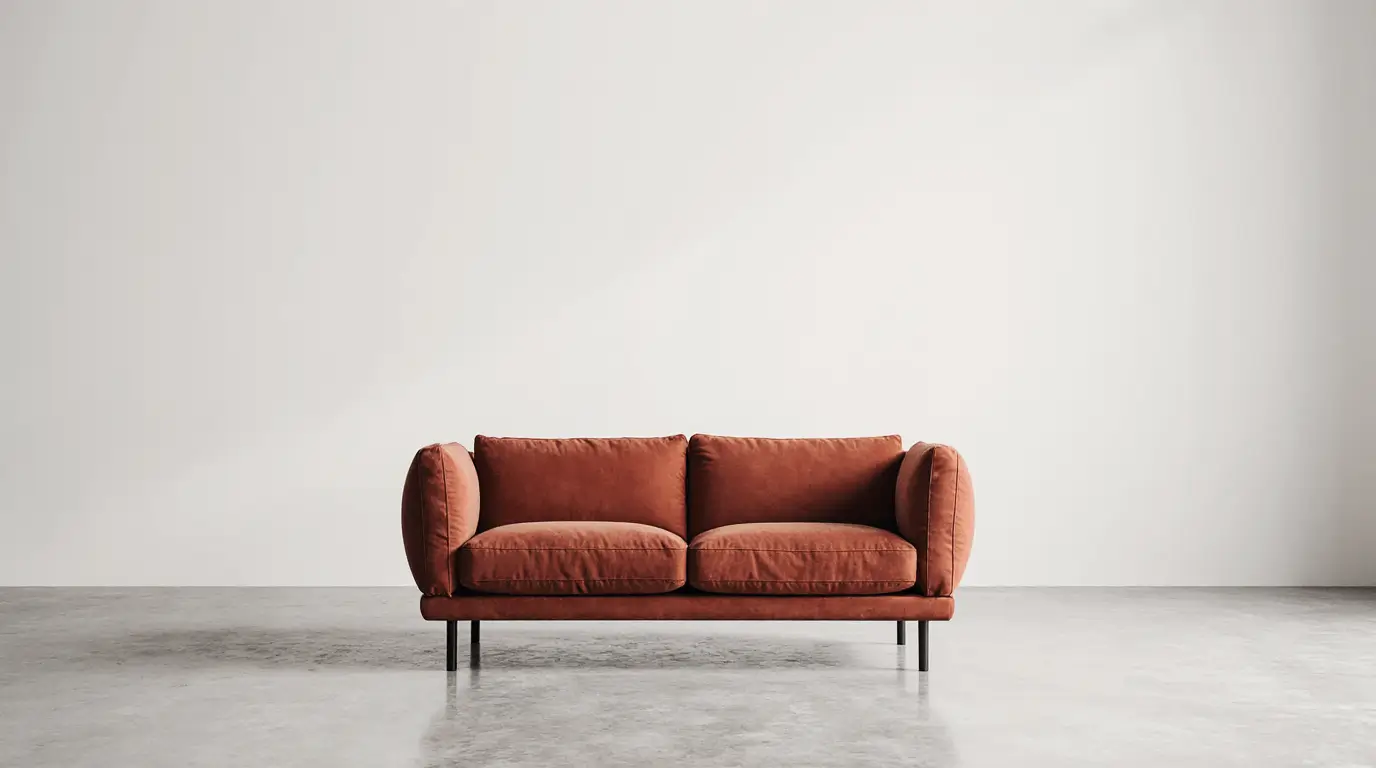
Red Accent Living Room Styling
A red accent in interior design is ideal for those hesitant to commit fully. Accent chairs, cushions, or artwork provide impact without dominating the space.
Strategic placement ensures the eye travels naturally around the room.
Red Walls in Interior Design
Red walls require confidence and proper lighting. Warm-toned reds create comfort, while cooler reds feel contemporary and sharp.
Pairing red walls with light ceilings keeps the space open and breathable.
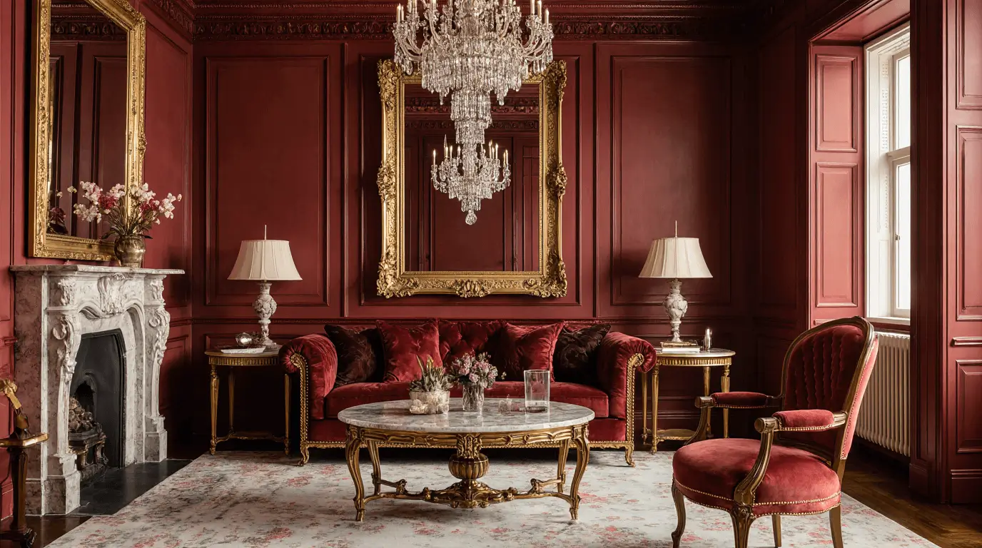
Red and Gold Interior Design Harmony
Red interior design paired with gold evokes classic elegance. This combination works beautifully in traditional, art deco, and festive interiors.
Metallic finishes add reflection, preventing heaviness.
Red and Black Interior Design Contrast
Red and black interiors create bold, high-impact environments. The key is proportion—too much black can overpower the warmth of red.
Using texture variations keeps the design refined rather than harsh.
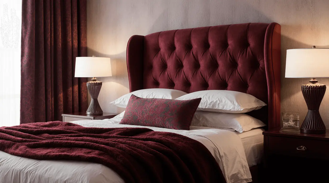
Red Bedroom Interior Design
In bedrooms, red interior design should lean toward muted or deep tones for comfort. Layered textiles soften intensity.
Using red through bedding, upholstered headboards, or drapery maintains warmth without overstimulation.
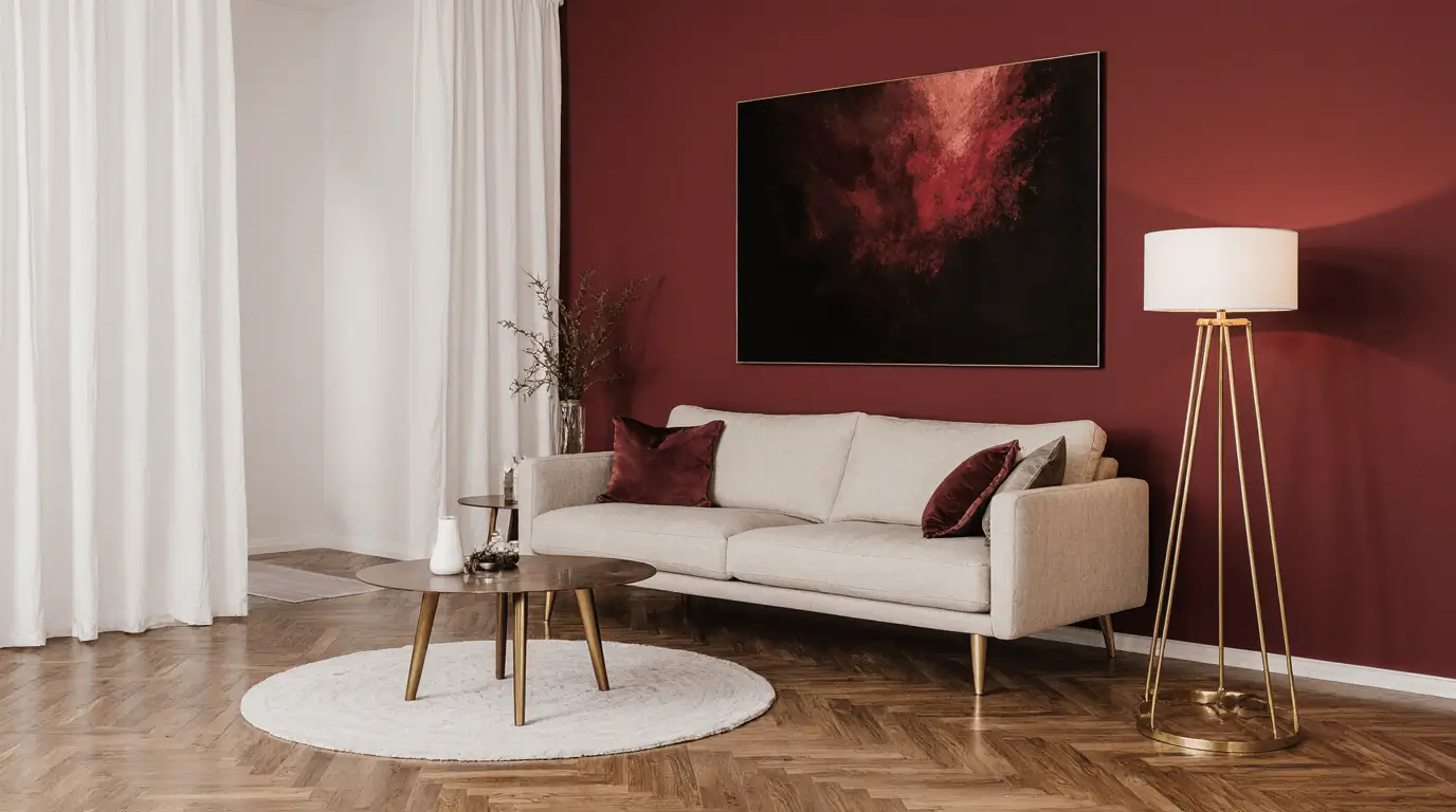
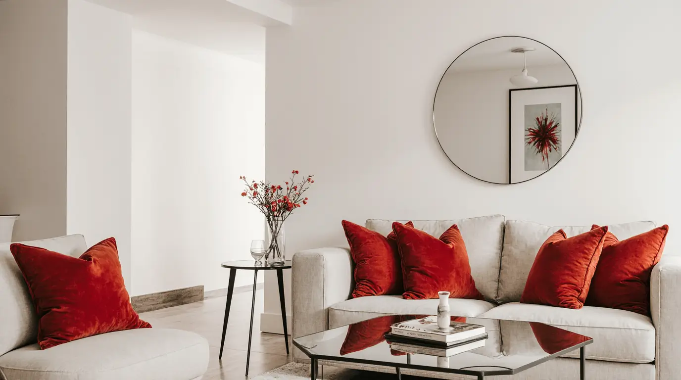
Red Interior Design with Neutral Balance
Neutral tones like beige, taupe, and cream stabilize red interior design. This pairing allows red to stand out while maintaining harmony.
Natural materials such as linen, wood, and stone enhance balance.
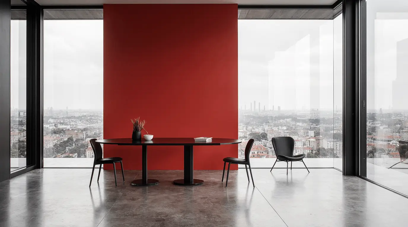
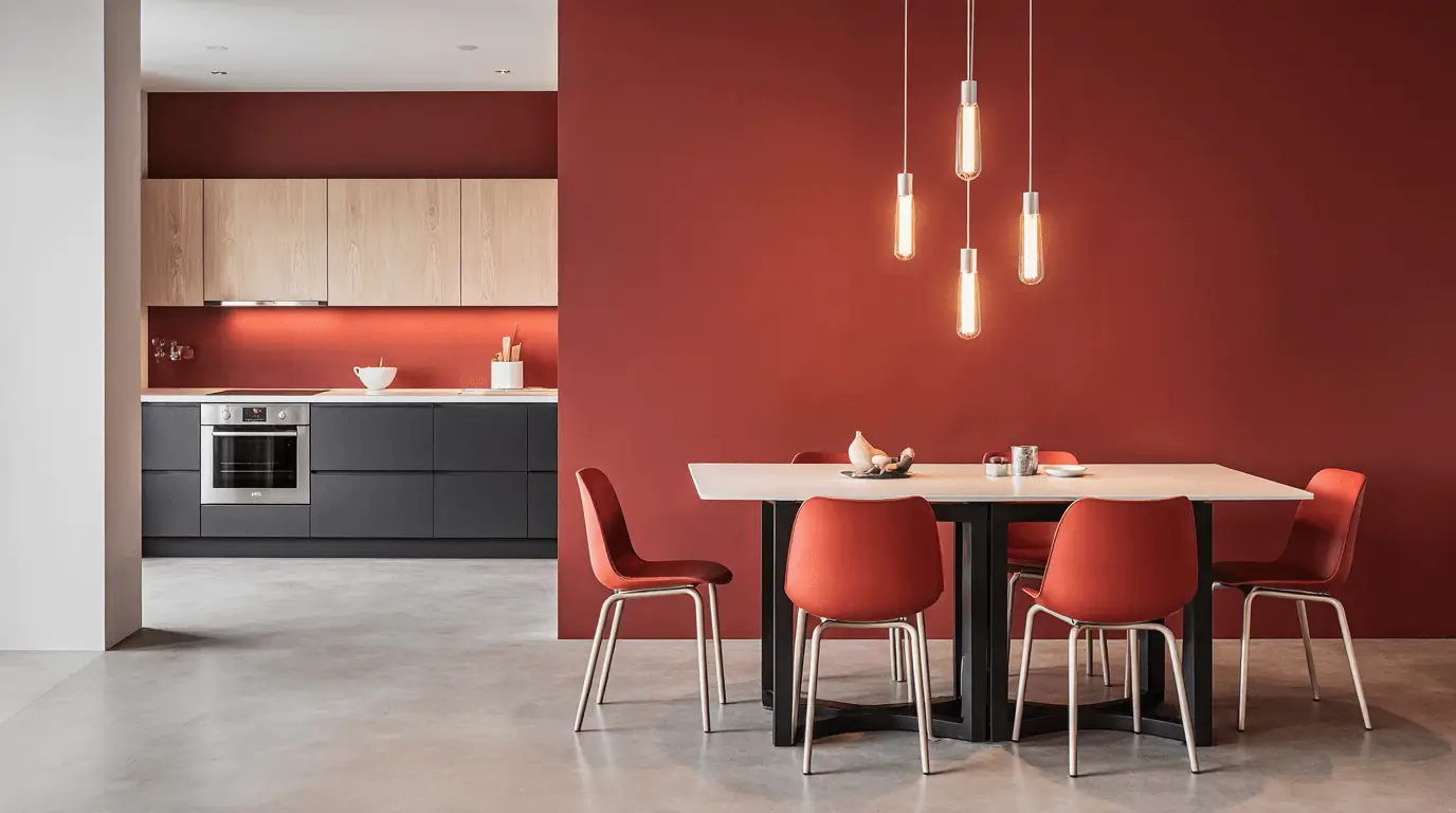
Contemporary Red Interior Design in Open Spaces
Open-plan layouts benefit from controlled red placement. Using red to define zones—such as dining or lounge areas—creates structure.
Accent lighting enhances the visual boundary.
Red Interior Decor Accessories
Smaller decor elements allow experimentation. Vases, rugs, art pieces, and cushions introduce personality without permanent commitment.
Layering shades of red creates visual richness.
Red Interior Design in Traditional Homes
Traditional interiors embrace richer reds paired with dark woods and ornate detailing.
Crown molding, patterned fabrics, and antique finishes complement the warmth of red beautifully.
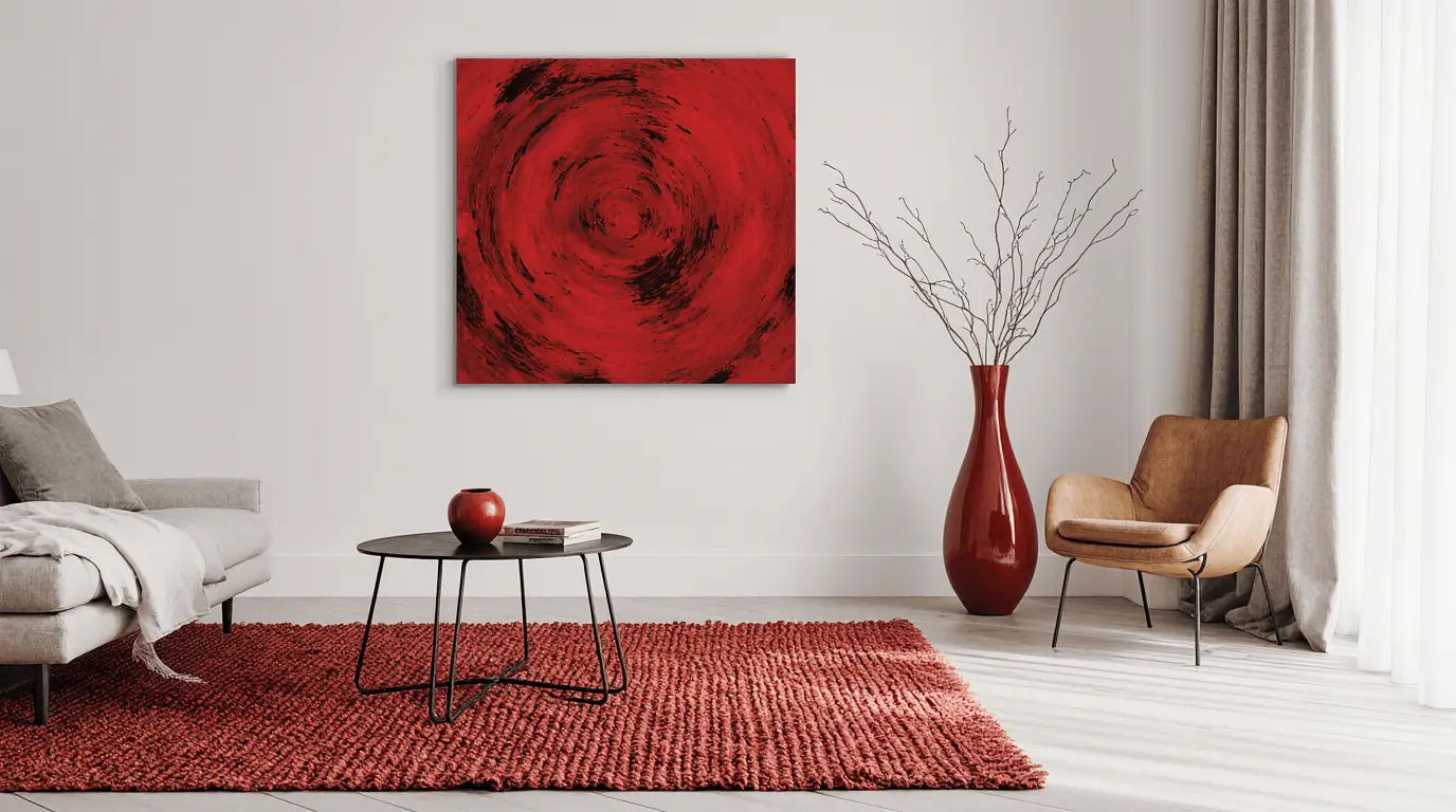
Minimalist Red Interior Design
Minimalist red interior design focuses on restraint. A single red focal point against a white or gray background creates dramatic clarity.
The simplicity enhances the emotional power of the color.
Red Interior Design for Small Spaces
In compact rooms, red works best as an accent rather than a dominant wall color.
Mirrors, light floors, and strategic lighting prevent the space from feeling closed in.
Red Interior Design with Texture Layering
Texture transforms red interior design from flat to luxurious. Velvet, silk, leather, and matte paint each create different emotional responses.
Layering textures keeps bold red visually dynamic and sophisticated.
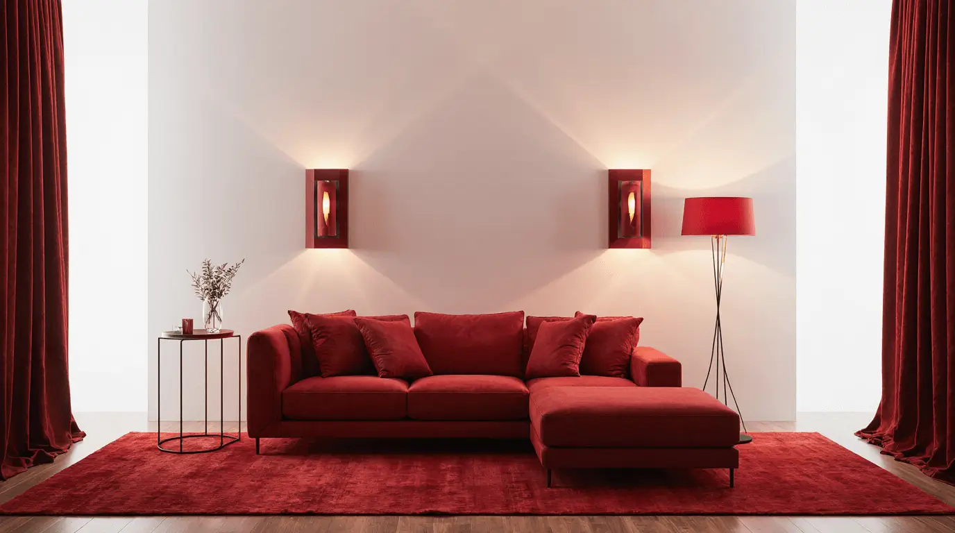
Red Interior Design and Lighting Strategy
Lighting determines how red behaves in a space. Warm lighting enhances coziness, while cool lighting sharpens vibrancy.
Testing paint samples under day and night lighting prevents costly mistakes.
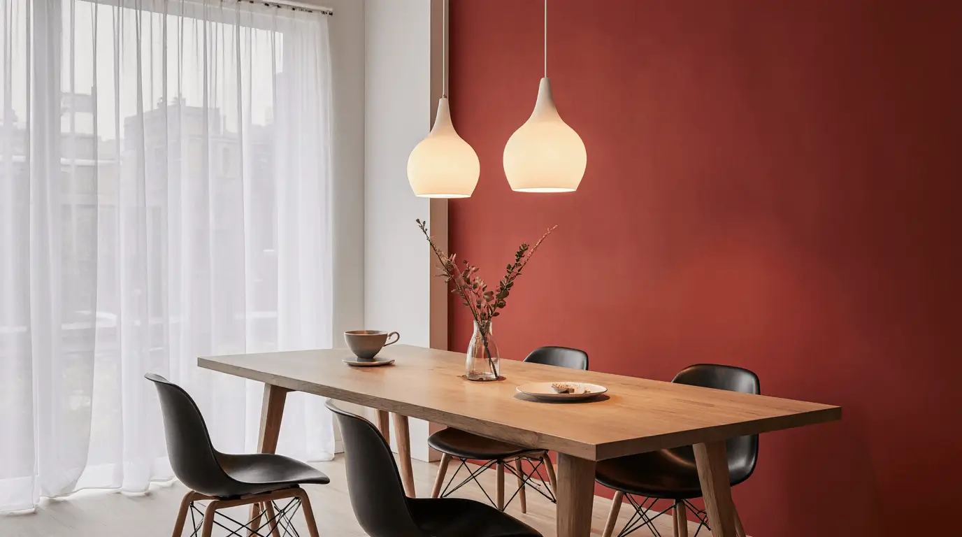
Red Interior Design in Contemporary Dining Rooms
Red stimulates appetite and conversation, making it ideal for dining areas.
Pairing red with natural wood and statement lighting creates a welcoming yet refined setting.
Conclusion: Designing with Confidence and Intention
Red interior design is not simply about choosing a bold color—it’s about shaping emotion, atmosphere, and identity within a space. When handled thoughtfully, red becomes a design instrument that adds warmth, depth, and unmistakable character. The difference between overwhelming and extraordinary lies in proportion, lighting, texture, and context.
In real homes, I’ve seen red transform flat, uninspired rooms into layered, memorable interiors. Deep tones can create intimacy in dining areas and bedrooms, while brighter variations energize living spaces. The key is restraint and clarity of purpose. Instead of asking, “Should I use red?” the better question is, “Where will red create the most impact?”
Red interior design works especially well for homeowners who want their space to feel expressive, confident, and emotionally engaging. It benefits those who appreciate warmth, drama, or timeless elegance—but it rewards thoughtful execution. Start small if needed: an accent chair, layered textiles, or a feature wall tested under different lighting conditions. Build gradually and evaluate how the color feels throughout the day.
When applied with balance and intention, red doesn’t overpower a room—it anchors it. And once you understand how to control its intensity, you can design with clarity and confidence rather than hesitation.
Learn more : Global Heritage Interior Design: Style Explained
Frequently Asked Questions
- Is red interior design too bold for everyday living?
Not when used strategically. Full red walls may feel intense in some settings, but accents, textiles, or deeper muted tones can make the color feel grounded and livable. The impact depends on shade, lighting, and surrounding materials.
- What shades of red are easiest to decorate with?
Burgundy, brick, terracotta, and wine tones are generally easier to integrate than bright primary red. They contain subtle brown or blue undertones, which make them feel richer and more sophisticated in residential interiors.
- How can I prevent a red room from feeling overwhelming?
Balance is essential. Pair red with neutral flooring, soft furnishings, natural wood, or metallic accents. Adequate lighting—both natural and layered artificial light—also ensures the color feels warm rather than heavy.
- Does red work in small spaces?
Yes, but placement matters. In smaller rooms, red often works best as an accent rather than a dominant wall color. Mirrors, lighter ceilings, and reflective surfaces help maintain openness while still enjoying the richness of red.
- Is red suitable for bedrooms?
It can be, particularly in deeper, muted shades. Rich burgundy or wine tones create intimacy and warmth. The key is layering with soft textiles and warm lighting to maintain comfort and relaxation.
- What colors pair best with red in interior spaces?
Neutrals such as cream, beige, taupe, and gray provide stability. Black creates dramatic contrast, gold introduces luxury, and natural wood softens intensity. The right pairing depends on whether you want modern sharpness or traditional warmth.
- How do I test red before committing fully?
Always sample paint directly on the wall and observe it during morning, afternoon, and evening light. Red shifts significantly under different lighting conditions. Living with a sample for a few days prevents costly mistakes and builds confidence in your final choice.
2 Responses
The positivity and optimism conveyed in this blog never fails to uplift my spirits Thank you for spreading joy and positivity in the world