Introduction
Opposition in interior design is the intentional use of contrast to create visual interest, balance, and emotional impact within a space. It works by placing opposing elements—such as light and dark, rough and smooth, modern and traditional—together in a controlled, thoughtful way. When applied correctly, opposition brings life to interiors without making them feel chaotic.
From years of practical design experience, opposition is one of the most powerful tools designers use to prevent spaces from feeling flat or predictable. It introduces tension that the eye finds engaging, while still respecting overall harmony and unity. The key is not conflict, but purposeful contrast.
In professional interiors, opposition often works alongside rhythm and harmony, guiding movement through a space and giving each design element a clear role. When mastered, it transforms ordinary rooms into expressive, memorable environments.
Opposition in Interior Design Explained
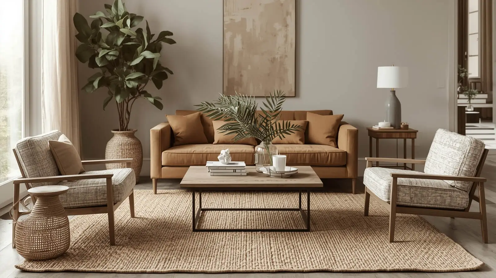
Opposition in interior design refers to the deliberate contrast between design elements to highlight differences while maintaining balance. This can include contrasting colors, forms, textures, or styles to enhance visual depth and clarity.
Rather than overwhelming a room, effective opposition clarifies structure and hierarchy, allowing each element to stand out while contributing to a cohesive whole.
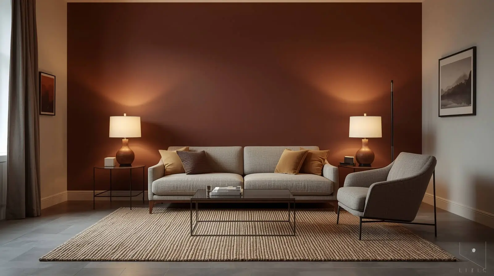
Color Opposition in Interior Design
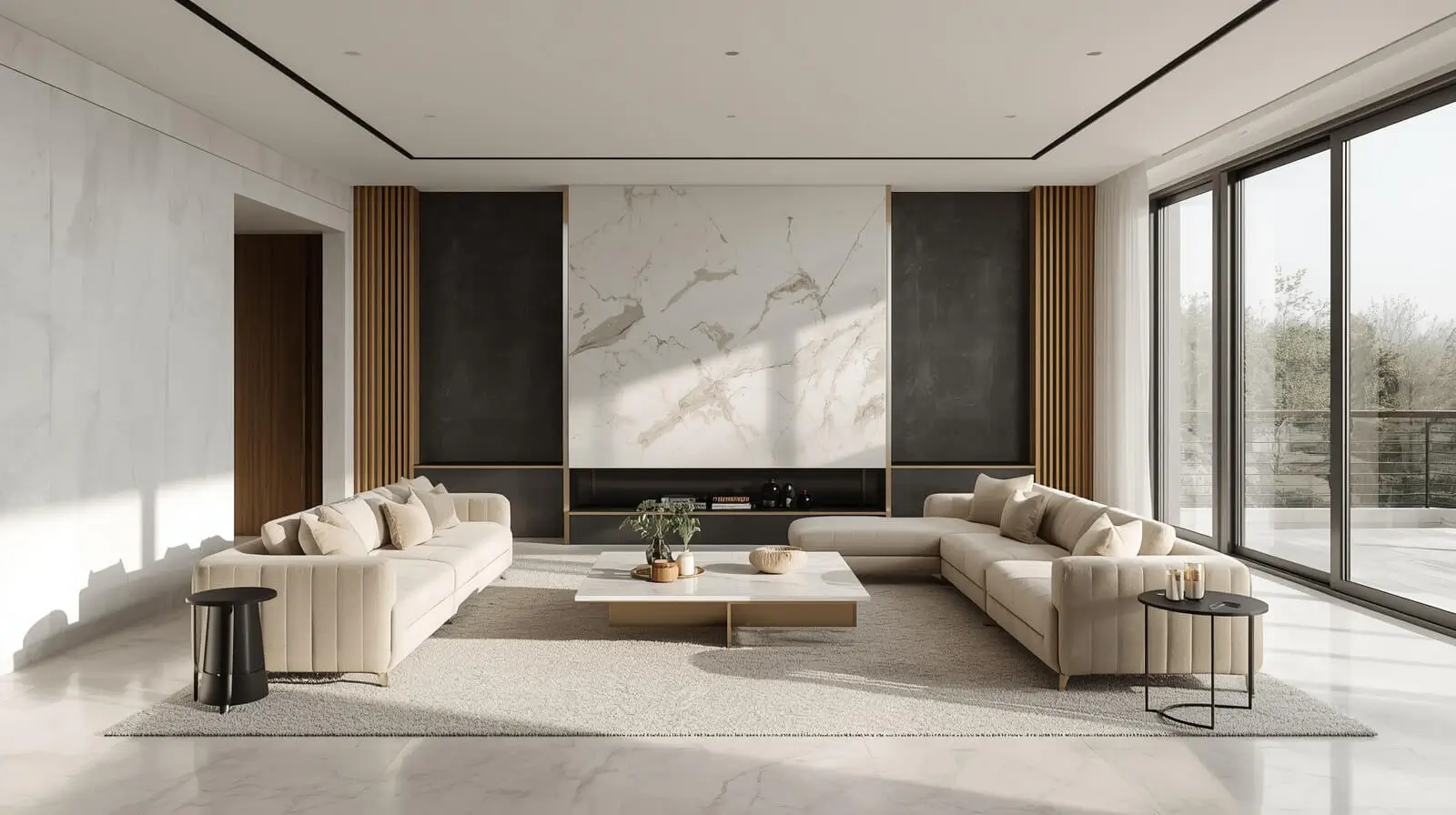
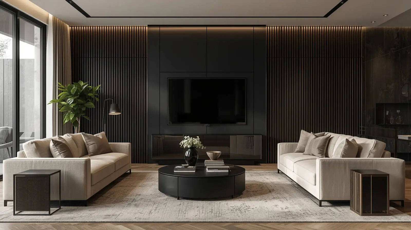
Color opposition uses contrasting hues—such as light versus dark or warm versus cool—to energize interiors. High-contrast palettes help define zones and emphasize architectural features.
Designers often soften strong color opposition with neutral backdrops to preserve comfort and visual balance.
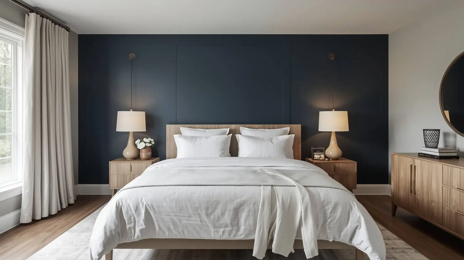
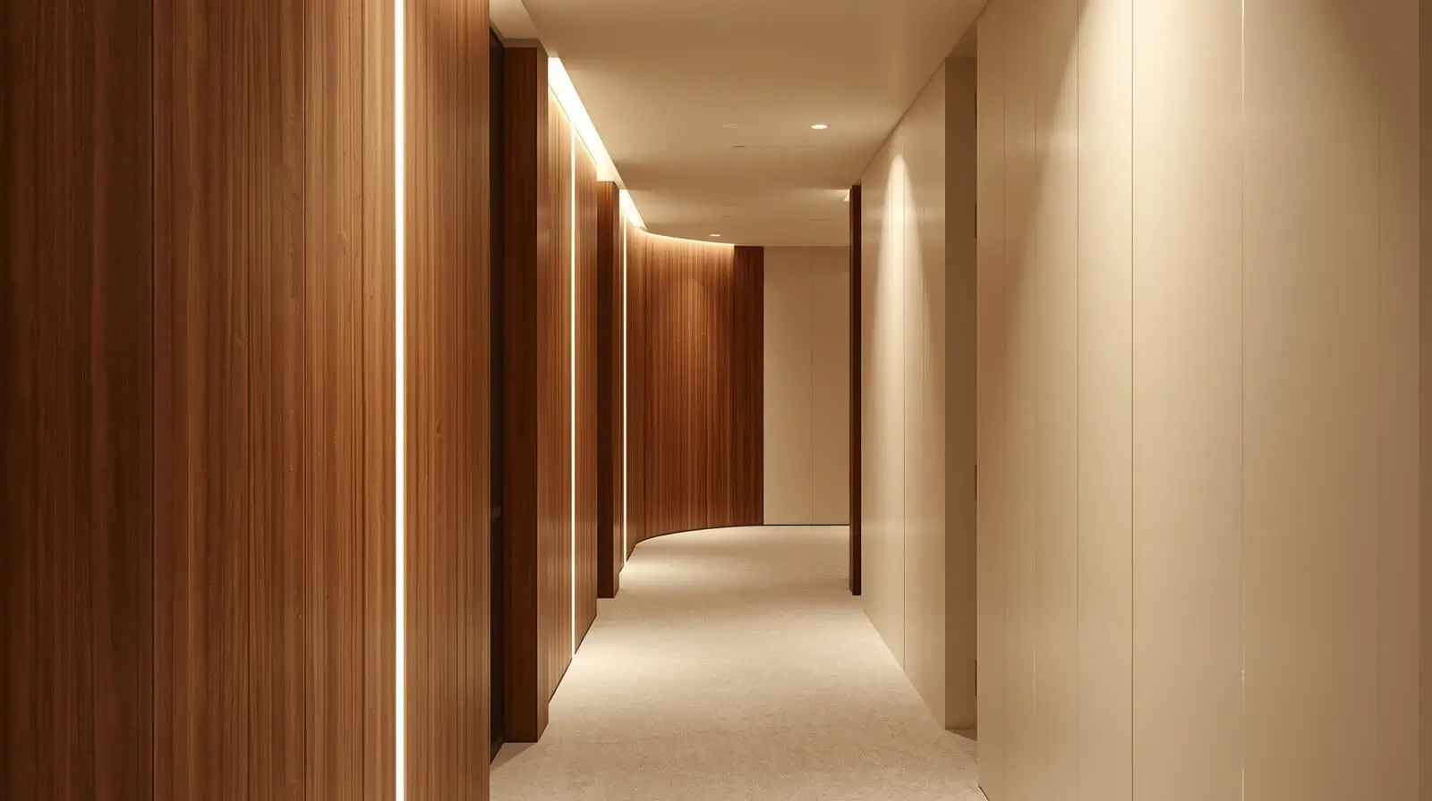
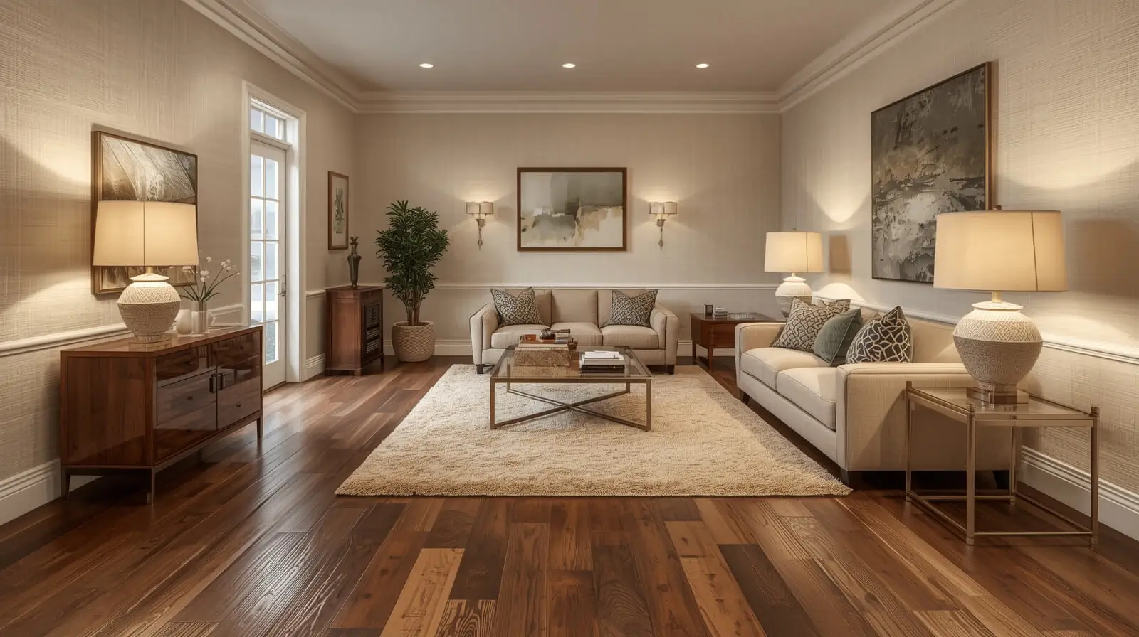
Light and Dark Opposition in Interior Design
Light and dark opposition creates depth and mood by playing with brightness levels. Dark surfaces anchor a space, while light elements add openness and airiness.
This contrast is especially effective in modern and transitional interiors where balance is essential.
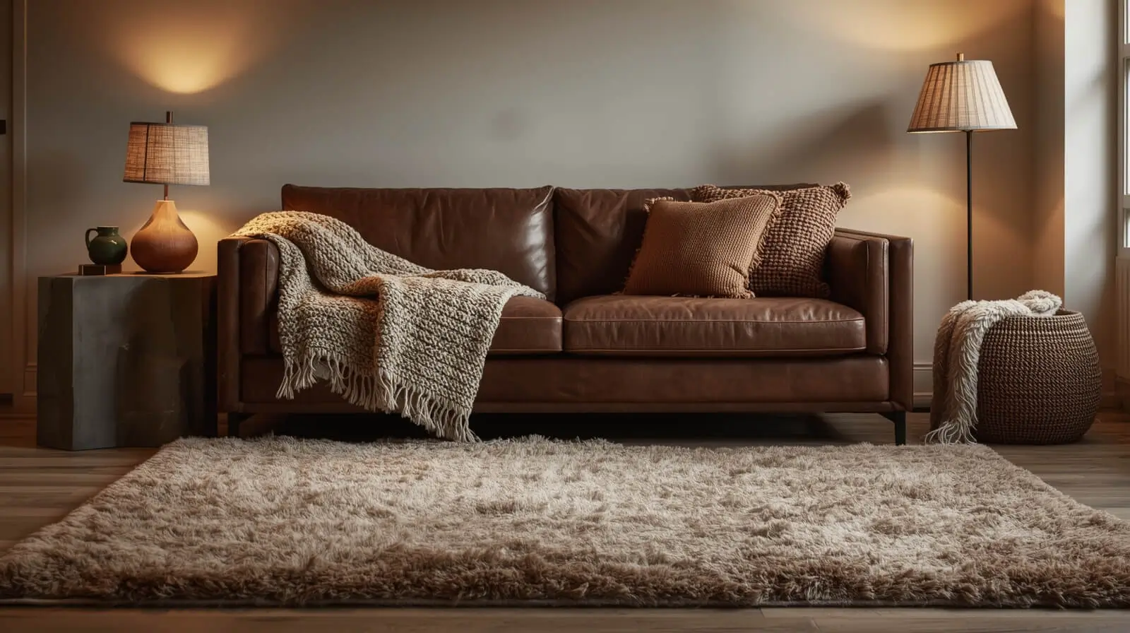
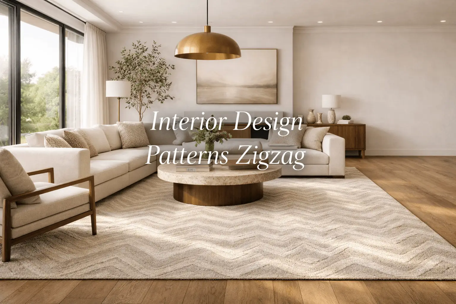
Texture Opposition in Interior Design
Texture opposition pairs smooth materials with rough or tactile surfaces to add sensory richness. Think polished stone beside raw wood or soft fabrics against hard metals.
This approach prevents interiors from feeling visually monotonous.
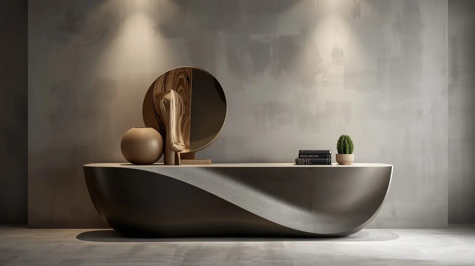
Form Opposition in Interior Design
Form opposition contrasts geometric shapes with organic or fluid forms. Straight-lined furniture balanced with curved accessories creates visual rhythm and comfort.
This technique is widely used to soften modern interiors.
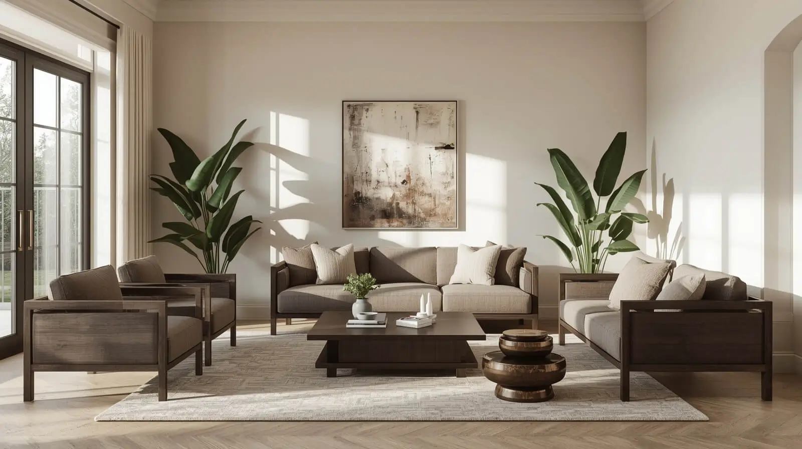
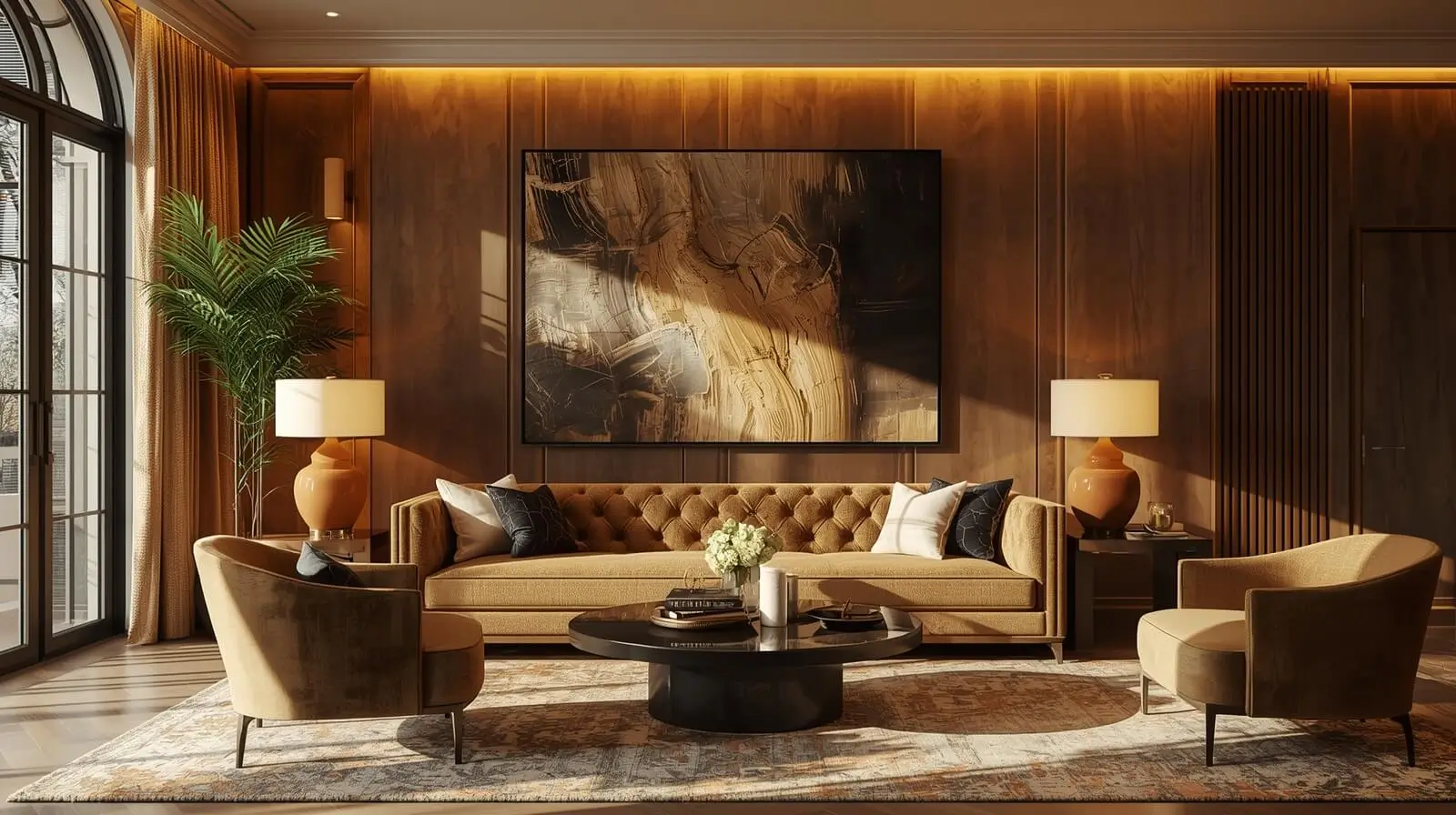
Material Opposition in Interior Design
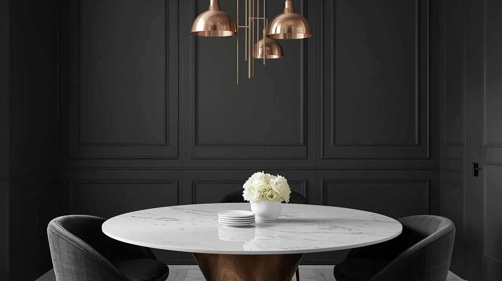
Material opposition highlights differences between natural and industrial elements, such as wood versus metal or stone versus glass.
This contrast reinforces authenticity and adds character to interiors.
Opposition Rhythm in Interior Design
Opposition rhythm uses repeated contrasts to guide the eye through a space. Alternating elements—like dark and light panels—create movement and flow.
It keeps interiors dynamic while maintaining order.
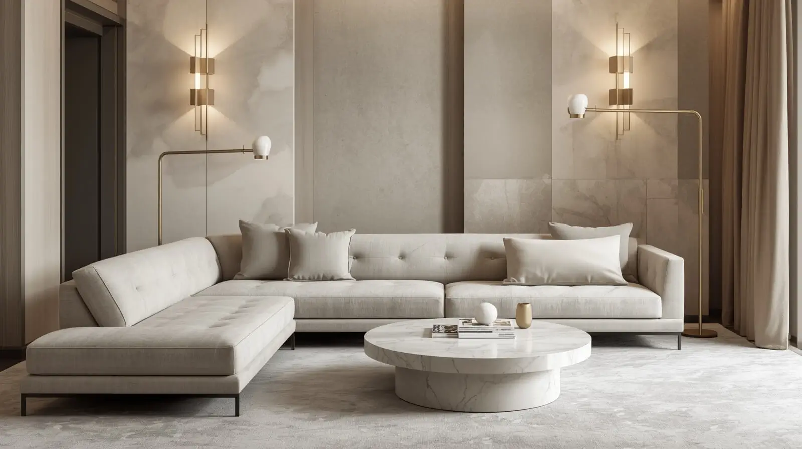
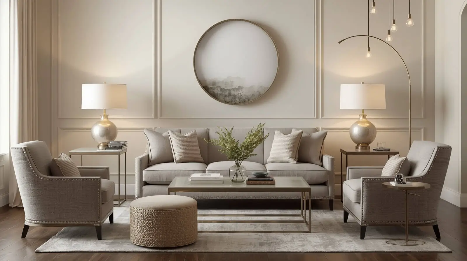
Opposition and Harmony in Interior Design
Opposition and harmony work together when contrast is balanced by shared colors, proportions, or materials. Harmony prevents opposition from becoming visual conflict.
Successful interiors always resolve contrast into cohesion.
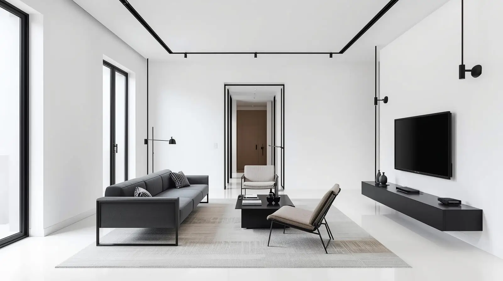
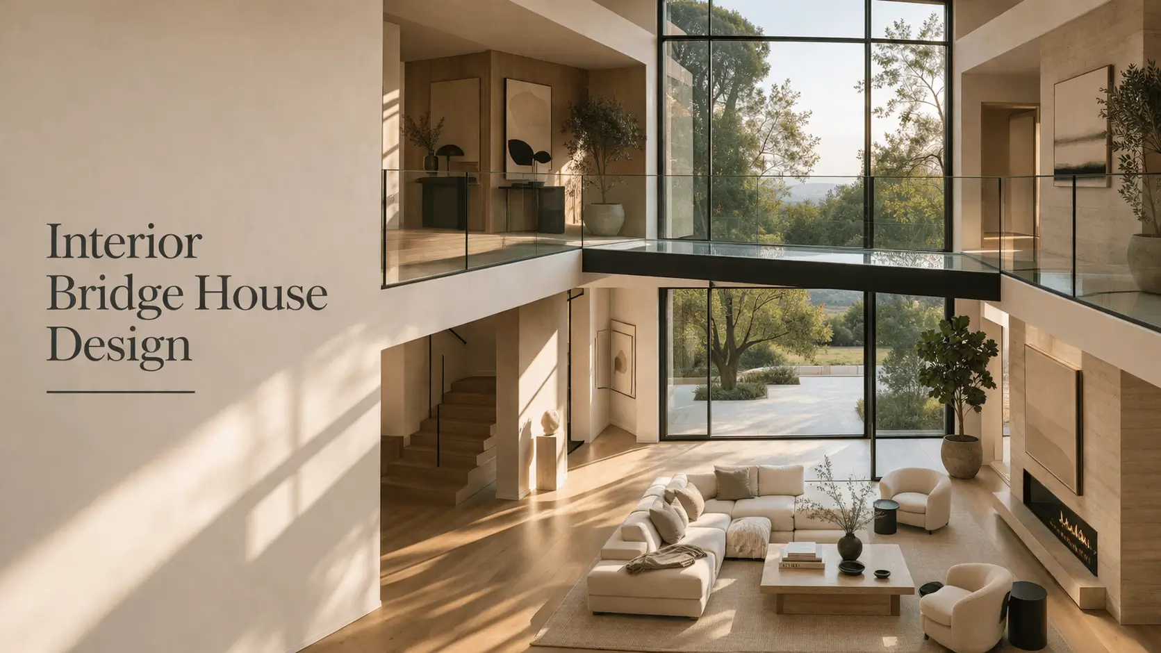
Opposition in Modern Interior Design
Modern interiors rely heavily on opposition to create clarity and sophistication. Clean lines are often contrasted with bold accents or textures.
This contrast keeps minimal spaces visually engaging.
Opposition in Transitional Interior Design
Transitional interiors use opposition to blend traditional warmth with modern simplicity. Classic forms contrast with contemporary finishes.
This balance makes transitional spaces timeless and adaptable.
Opposition in Furniture Selection
Furniture opposition balances scale, style, or material to avoid uniformity. A heavy sofa paired with light chairs adds visual balance.
This method enhances comfort and spatial clarity.
Opposition in Interior Design Styling
Styling opposition involves mixing bold décor with restrained elements. Statement pieces stand out more when surrounded by simplicity.
This approach creates focal points without clutter.
Opposition in Wall and Floor Design
Wall and floor opposition uses contrast to ground spaces. Dark floors with light walls or patterned walls with simple flooring enhance depth.
It helps visually anchor interiors.
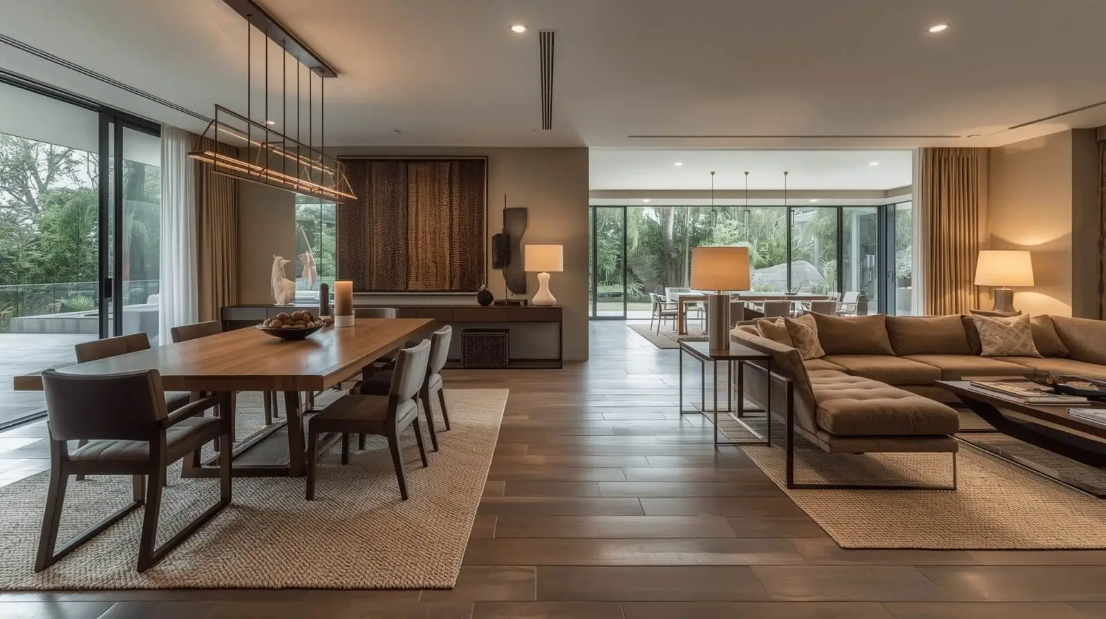
Opposition in Open-Plan Interiors
Open-plan spaces rely on opposition to define zones without walls. Contrast in color, lighting, or furniture style separates functions naturally.
This keeps large spaces organized and engaging.
Opposition in Interior Design for Visual Balance
Visual balance through opposition ensures no element dominates unfairly. Strong contrasts are countered with neutral or calming features.
This creates comfort alongside visual excitement.
Why Opposition in Interior Design Works
Opposition works because the human eye is naturally drawn to contrast. It creates focus, movement, and emotional response while reinforcing structure.
When used intentionally, opposition transforms interiors from static to expressive without sacrificing harmony.
Conclusion: Bringing Contrast Into Balance
Opposition in interior design works because it mirrors how we experience the world—through contrast, comparison, and balance. Light feels brighter next to dark. Texture feels richer when set against something smooth. When these differences are applied with intention, they don’t compete; they clarify. They give a space structure, energy, and emotional depth.
In real homes, opposition is what keeps interiors from feeling flat or overdesigned. It allows personality to emerge without sacrificing comfort. Whether you’re mixing modern and traditional elements, balancing bold choices with restraint, or defining zones in an open-plan layout, contrast gives you a framework for making confident decisions. It tells you not just what to choose, but why it belongs.
This approach benefits anyone who wants a home that feels thoughtful rather than trend-driven. Designers use opposition instinctively, but homeowners can apply it just as effectively by paying attention to balance—pairing strong elements with calming ones, and letting each choice serve a purpose. When done well, opposition doesn’t shout. It guides. And that’s what makes interiors feel both expressive and livable, long after the design is complete.
Learn more : 12+ Stunning Secrets of Form in Interior Design
Frequently Asked Questions
- What does opposition mean in interior design, in simple terms?
Opposition in interior design means using contrast on purpose. It’s about placing different elements—such as light and dark, soft and hard, or modern and classic—together in a way that feels balanced rather than random. The goal is visual interest, not conflict.
- Can opposition make a space feel overwhelming?
It can, but only if contrast is applied without balance. Strong opposition works best when it’s supported by neutral elements, consistent proportions, or repeated materials. These grounding choices allow contrast to feel intentional and comfortable instead of chaotic.
- Is opposition only suitable for modern interiors?
Not at all. Opposition is used in every design style, from traditional to transitional. In classic interiors, it might appear as ornate details against simple backdrops. In transitional spaces, it often shows up as a blend of old and new elements working together.
- How do I apply opposition in a small room?
In smaller spaces, subtle contrast works best. Focus on one or two opposing elements—like a dark accent against light walls or a textured piece in an otherwise smooth room. This adds depth without making the space feel crowded.
- How is opposition different from harmony?
Harmony is about unity; opposition is about contrast. The two are not opposites in practice—they work together. Opposition creates interest, while harmony ensures that all contrasting elements still feel connected and cohesive.
- Can furniture alone create effective opposition?
Yes. Furniture is one of the easiest ways to introduce contrast. Mixing heavy and light pieces, curved and straight forms, or different materials can create balance and visual movement without changing the architecture of a space.
- How do I know when I’ve used enough opposition?
When a room feels dynamic but calm, you’re likely there. If everything blends together, it may need more contrast. If it feels tense or busy, it may need restraint. Trust your eye and focus on how the space feels to live in, not just how it looks.
One Response