
Introduction
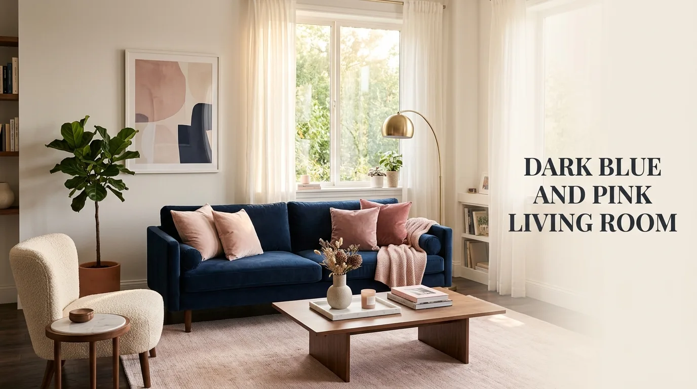
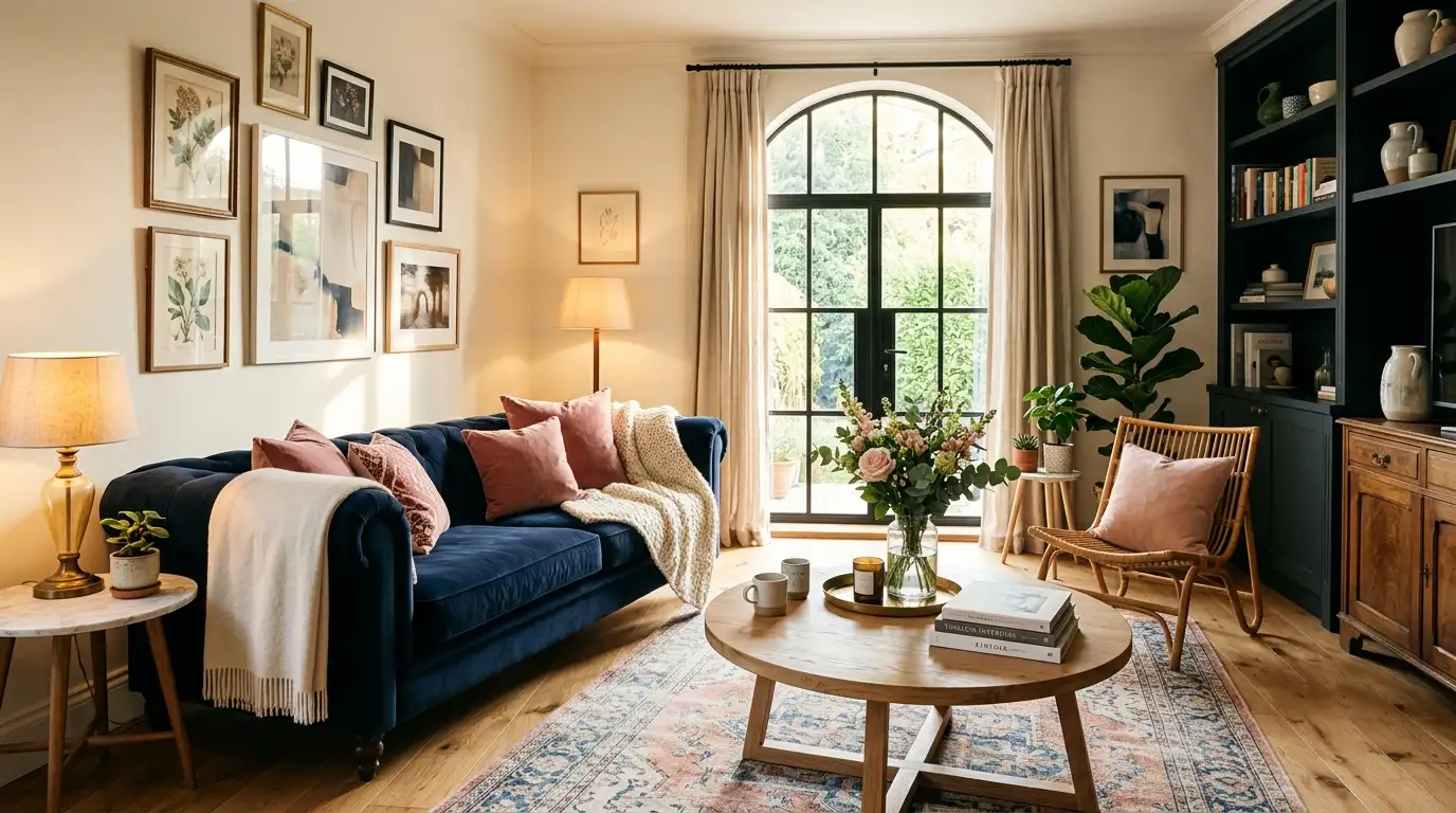
A dark blue and pink living room brings together one of the most quietly confident color pairings in modern interior design. Navy, in particular, has a depth that feels grounded and architectural, while pink — whether dusty rose, blush, or a brighter coral-pink — softens that weight with warmth. Used well, this combination doesn’t read as trendy or fussy; it reads as considered, the kind of room that looks like it was put together by someone who understands color, not just someone who liked two paint chips.
Designers gravitate toward this pairing because it solves a common problem: how to make a room feel cozy without losing sophistication. Dark blue alone can feel cold or heavy in a large dose, and pink alone can feel saccharine or too youthful. Together, each color corrects the other’s weakness. The navy supplies gravity and contrast; the pink supplies softness and light. This is why the combination shows up so often in living rooms anchored by a navy sofa, navy blue couch, or navy accent wall, finished with blush or dusty pink textiles, art, and accessories.
This guide walks through the practical decisions behind a successful dark blue and pink living room — from choosing the right sofa and wall treatment to balancing color ratios, layering texture, and avoiding the most common styling mistakes. Each section below focuses on one specific design decision, paired with a visual reference you can use for inspiration or AI image generation.
Why Dark Blue and Pink Work Together in a Living Room
Color theory explains part of this pairing’s success: navy sits opposite warm pinks on the color wheel in a soft complementary relationship, which is why the two never compete for attention the way two equally saturated colors might. In practice, this means a room can lean as moody or as light as the homeowner wants, simply by adjusting how much of each color appears. A living room that’s 70% navy with pink as accent feels dramatic and intimate; flip that ratio and the same palette feels airy and feminine without losing its grounding.
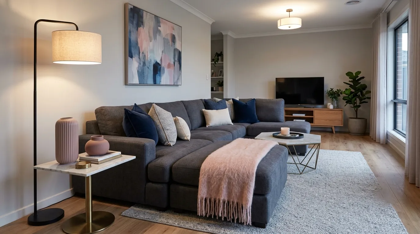
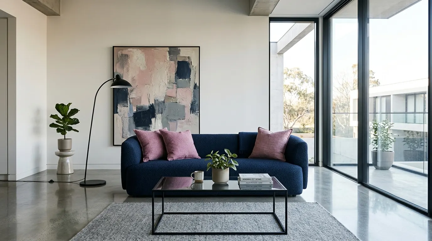
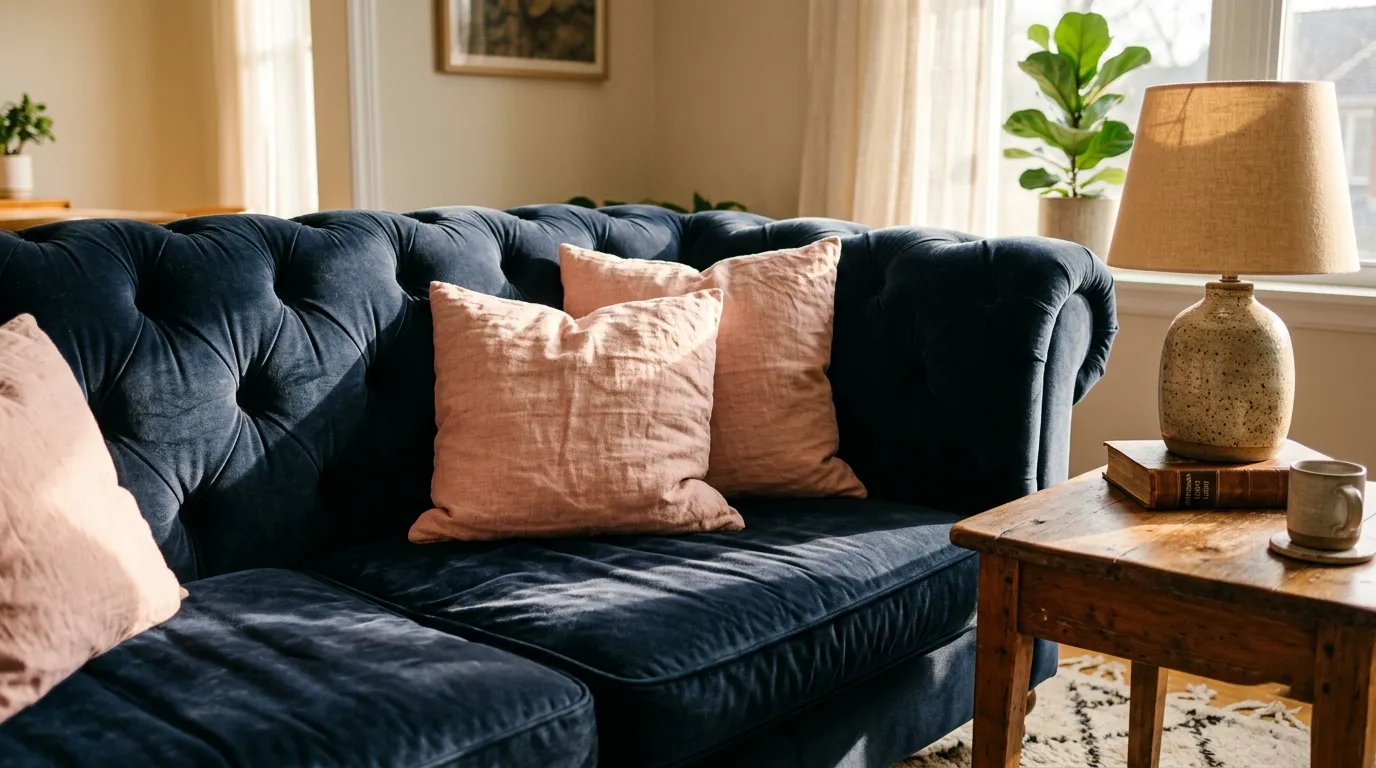
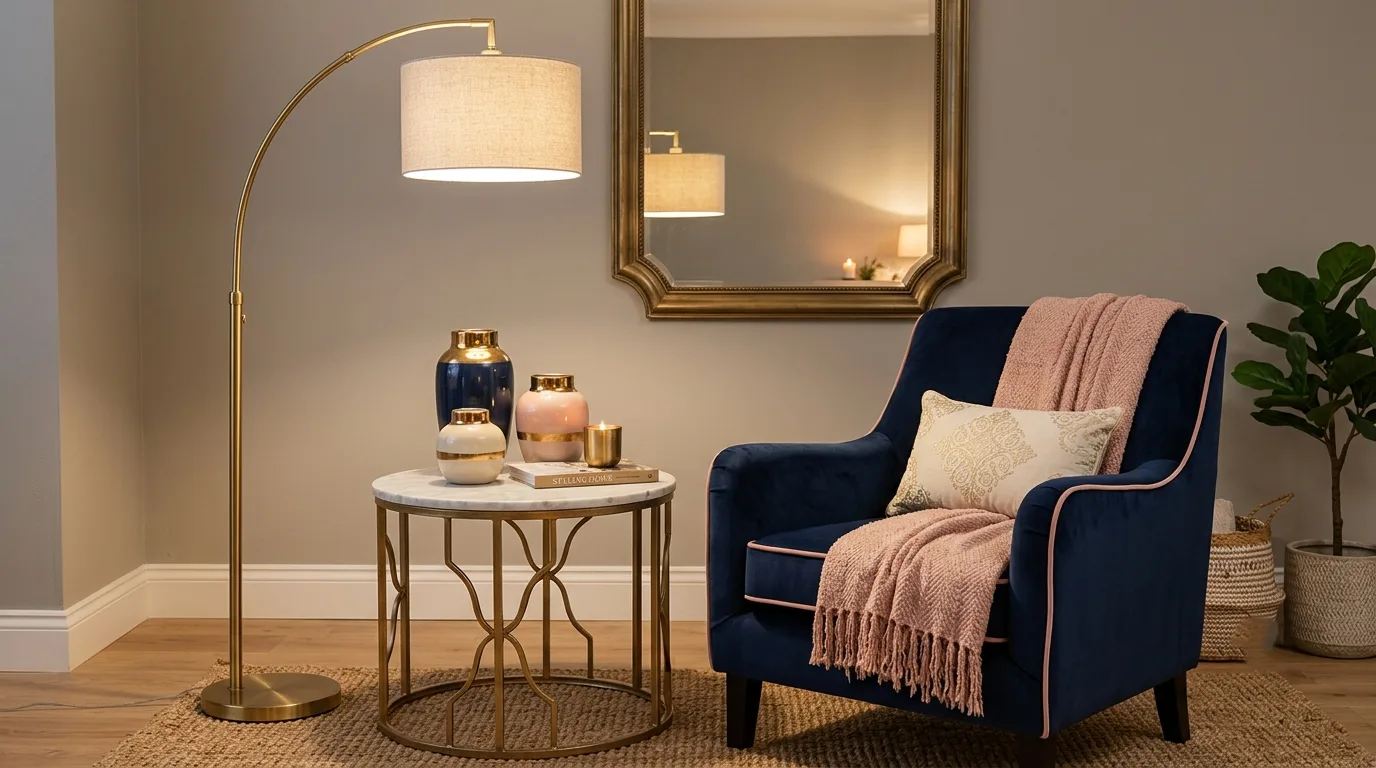
Navy Sofa as the Anchor Piece
The navy sofa is almost always the starting point for this color story, since a piece this large sets the tone for everything layered on top of it. A navy blue couch in velvet, linen, or performance fabric reads as a neutral in disguise — dark enough to anchor the room, flexible enough to pair with nearly any accent color. Choosing the sofa first, then building the pink accents around it, keeps the room from feeling like two competing ideas stitched together.
Decorating Around a Navy Blue Sofa
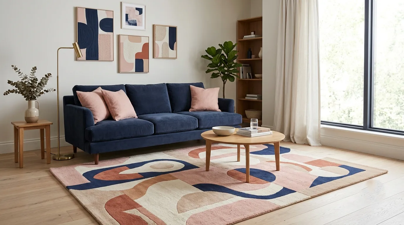
Once the navy sofa is in place, the rest of the room should support it rather than fight it. The most reliable approach is to keep large surfaces — walls, rugs, drapery — in lighter, warmer neutrals, and reserve pink for smaller, repeatable touches like pillows, art, and a single statement chair. This keeps the navy sofa from disappearing into a too-dark room while still letting the pink feel intentional rather than scattered.
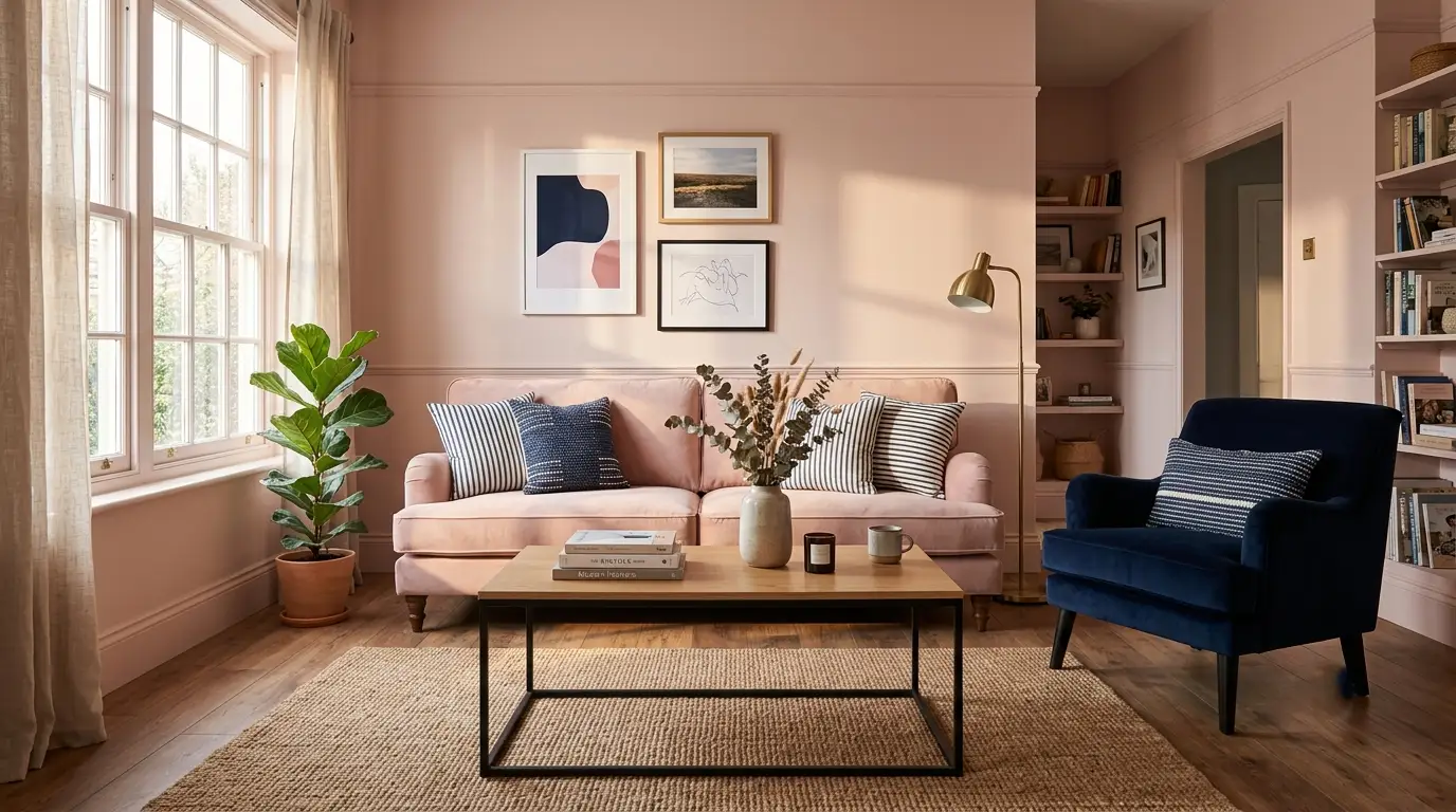
Blush Pink and Blush-Grey Accents for Softness
Adding grey alongside navy and blush pink creates a slightly more muted, contemporary version of this palette, often described as a navy, grey, and blush living room. The grey acts as a buffer between the two stronger colors, letting the navy feel less dominant and the pink feel less sweet. This three-color approach works particularly well in living rooms with a lot of natural light, since the grey keeps things from feeling overly saturated.
Balancing the Color Ratio Between Pink and Navy
The most common mistake in this palette is treating pink and navy as equal partners. A living room almost always reads better when one color leads and the other supports — typically navy as the dominant 60–70%, with pink filling the remaining accent space. Reversing this ratio is possible for a softer, more feminine room, but it requires deepening the navy in smaller doses, like piping on a sofa or a single dark accent chair, so the space doesn’t tip into pastel territory.
Modern Pink and Blue Living Room Styling
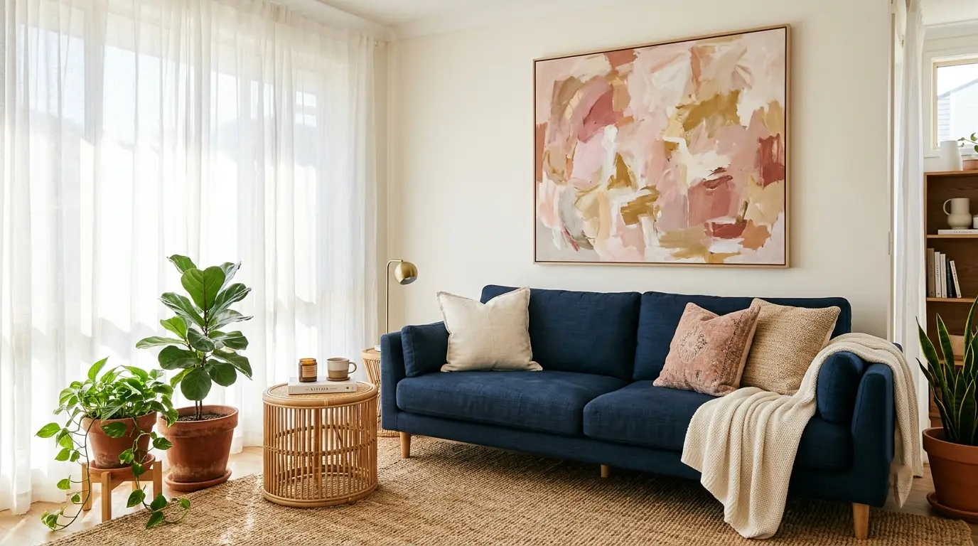
A more contemporary take on this palette leans into cleaner lines, matte finishes, and a more restrained color palette overall. Instead of dusty or vintage pink tones, modern interpretations often use a slightly cooler, almost mauve pink against a true navy, paired with matte black or brushed brass hardware. The effect feels current rather than nostalgic, which is useful for open-plan living rooms that connect to a kitchen or dining space.
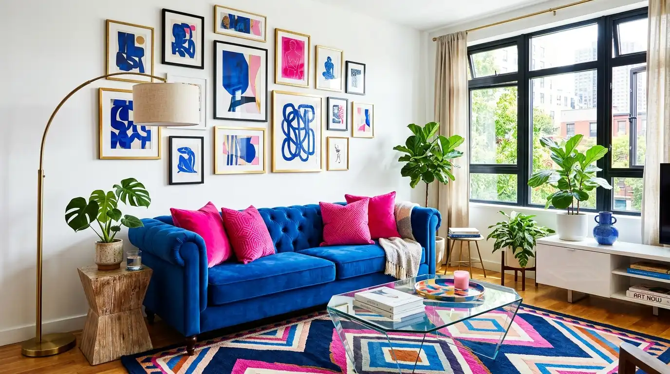
Royal Blue and Pink for a Bold Statement Living Room
For homeowners who want more energy than a muted navy-and-blush palette offers, royal blue paired with a brighter pink creates a livelier, more confident version of the same idea. This combination works best in living rooms with strong natural light and clean architectural lines, since the higher saturation needs space to breathe rather than competing patterns or heavy furniture.
Choosing Fabric and Texture for a Navy Blue Couch
The fabric of a navy couch changes how the entire room feels. Velvet softens the navy and adds warmth, making it a natural match for pink’s softness; linen or boucle keeps things more casual and textural; performance fabric is the practical choice for busy households without sacrificing the deep color. Matching the sofa’s texture to the room’s overall formality — more velvet for a refined room, more linen or boucle for a relaxed one — keeps the whole space feeling cohesive.
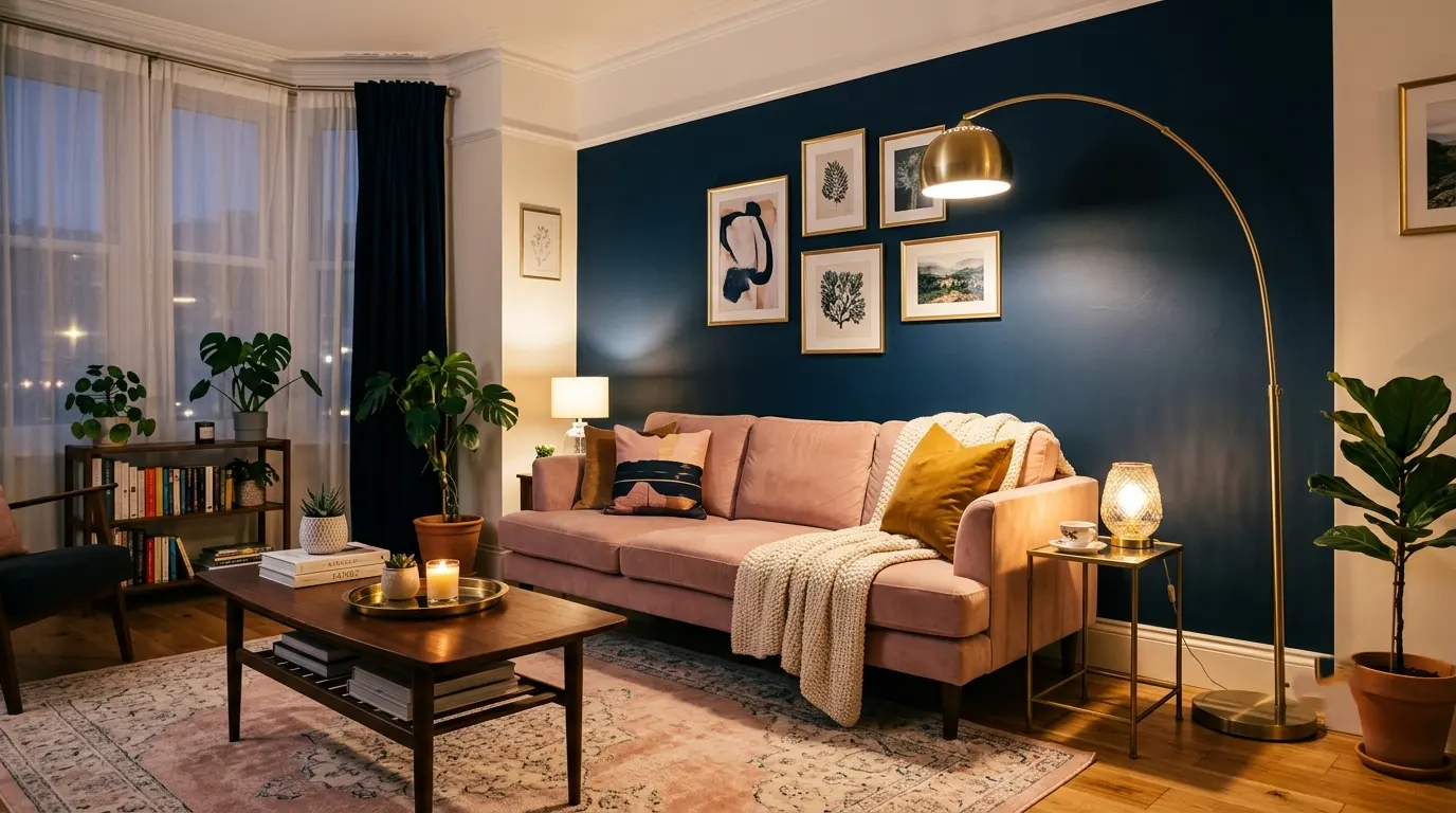
Wall Color and Paint Pairings for a Navy and Pink Room
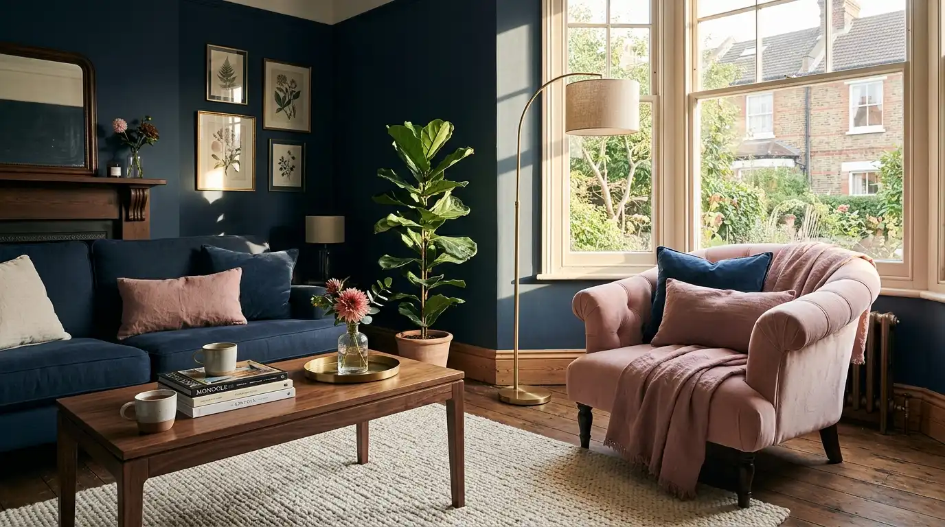
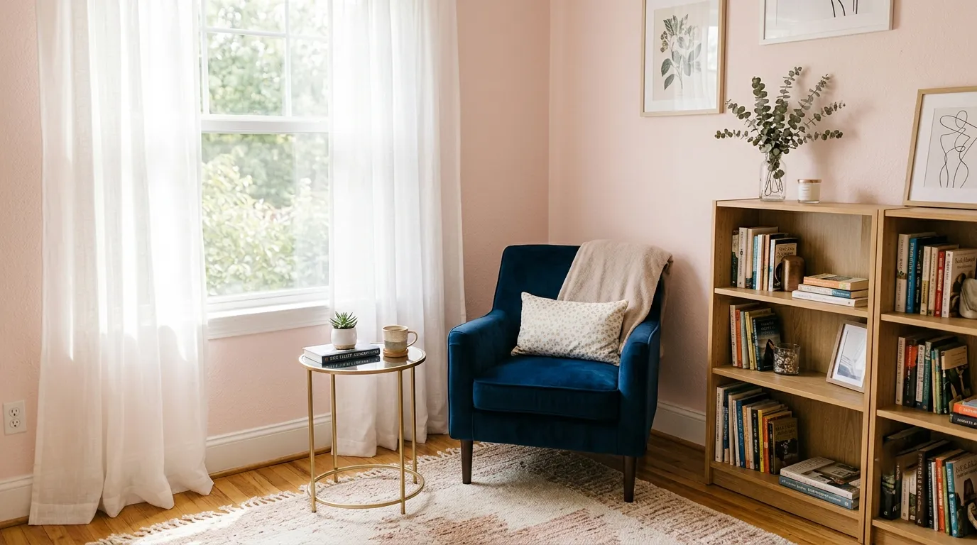
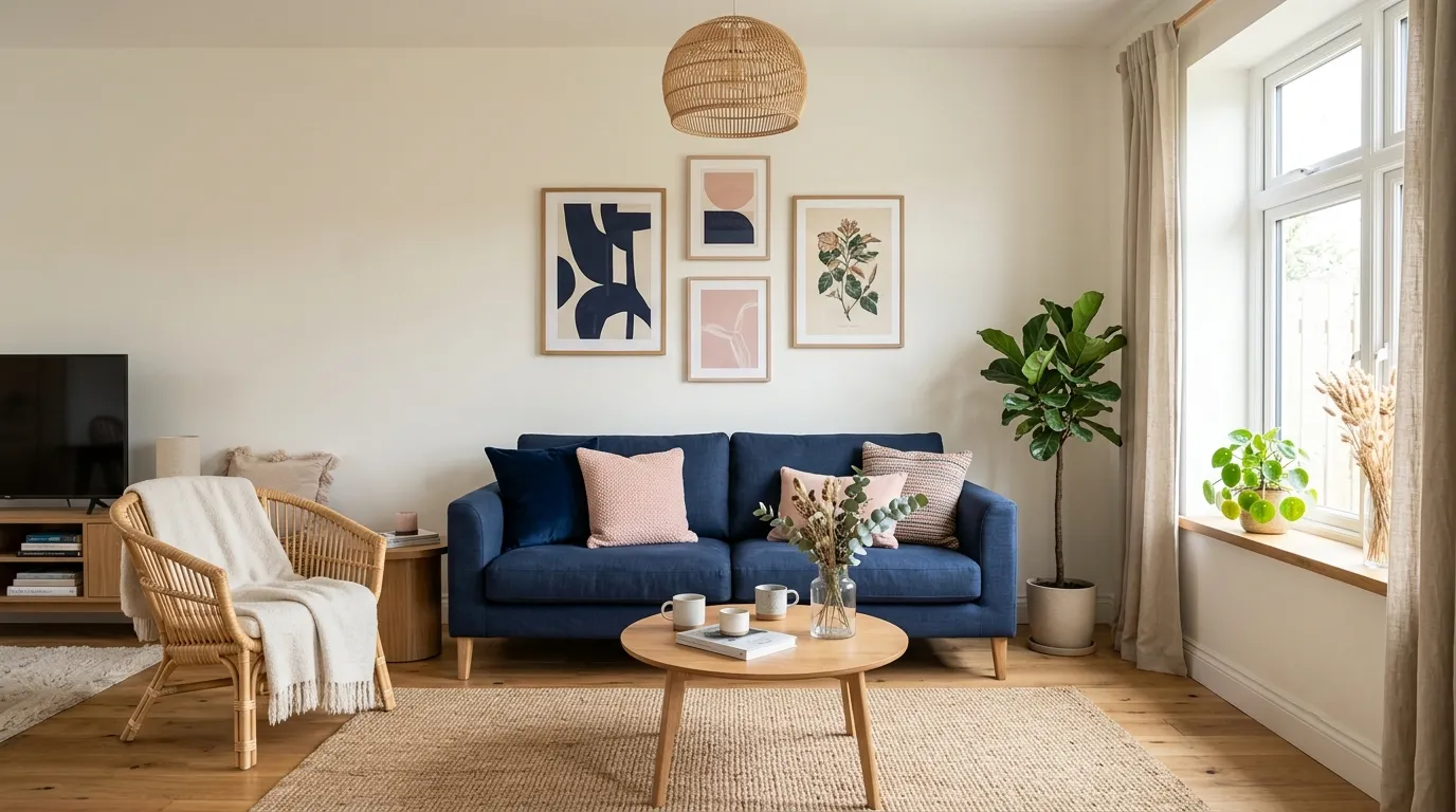
Walls in this palette generally fall into one of three approaches: a warm white or cream that lets the furniture carry the color story, a soft blush that flips the dominant color to pink, or a full navy wall used as a dramatic backdrop for lighter pink furniture. Each works, but they create very different moods, so it’s worth deciding early whether the room should feel cozy and enclosed (navy walls) or bright and open (light walls with color saturation in furniture).
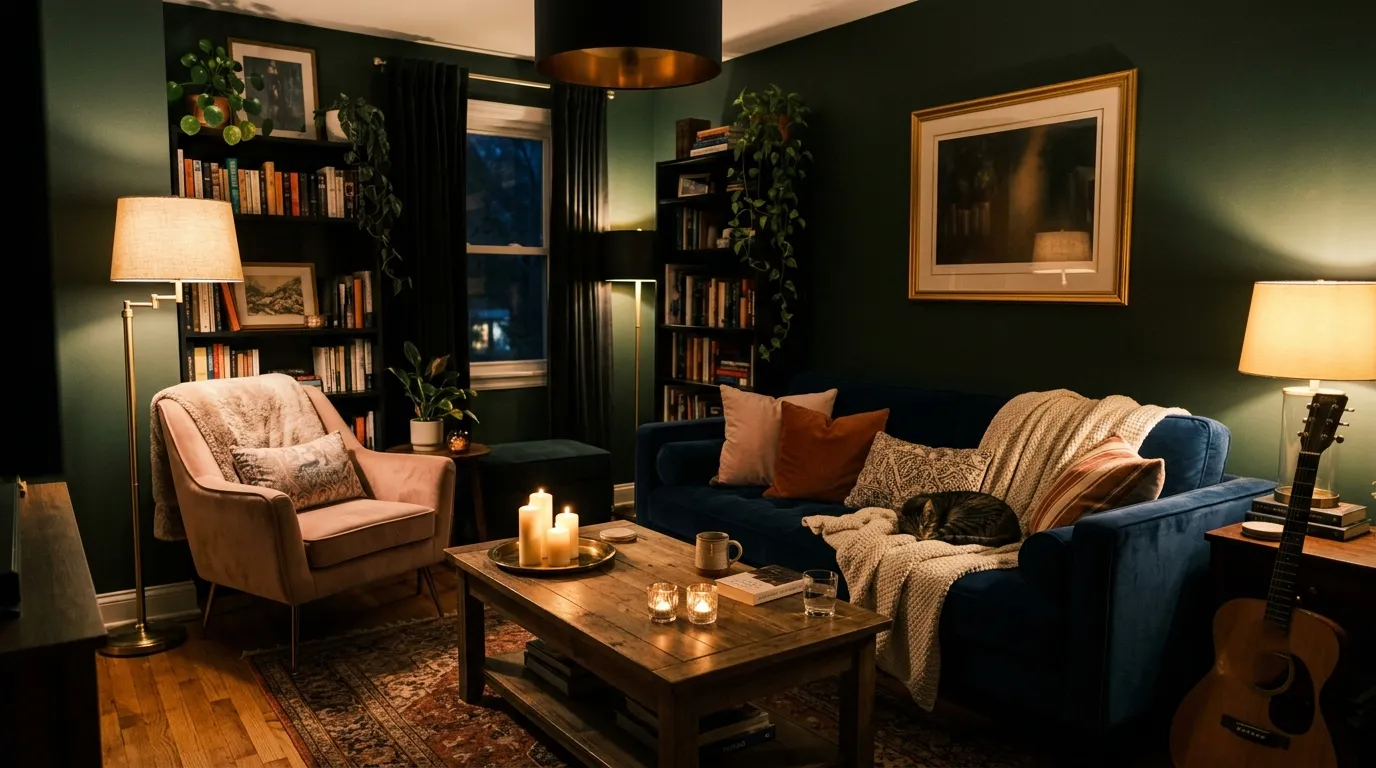
Lighting Choices That Flatter Navy and Pink Together
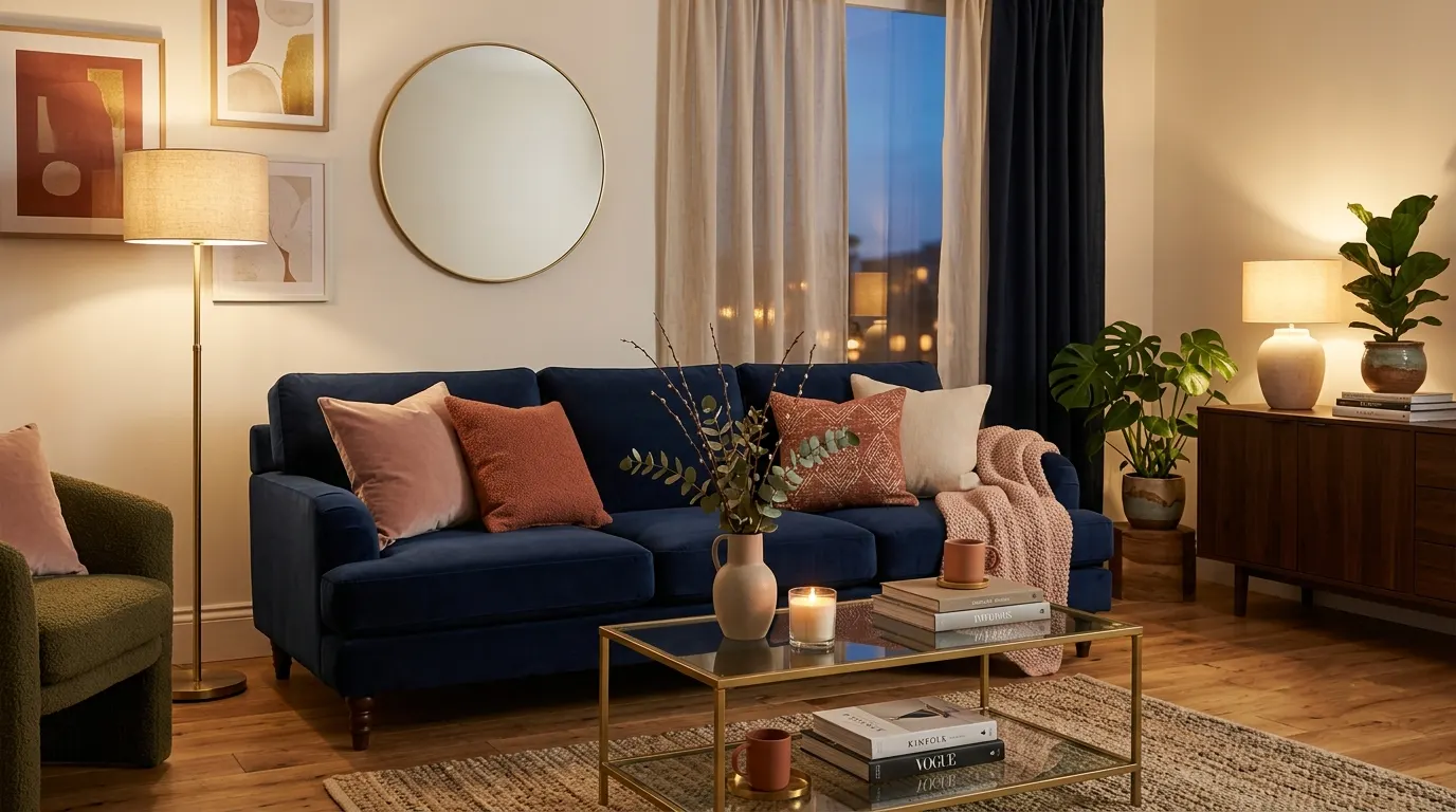
Both navy and pink respond strongly to the warmth or coolness of a room’s lighting. Warm-toned bulbs (around 2700K) bring out the richness in navy and the warmth in pink, while cooler lighting can make navy feel flat and pink feel washed out. Layering ambient ceiling light with warm lamp light and a dimmer switch gives the most flexibility, especially in the evening when this palette tends to look its richest.
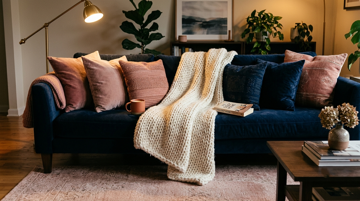
Layering Textiles, Rugs, and Throw Pillows
Texture does as much work as color in this palette. A flat-weave rug in a neutral or blush tone keeps the floor from competing with the sofa, while a mix of velvet, linen, and boucle pillows in varying shades of navy and pink adds depth without adding visual noise. The goal is tonal variation within each color family — several shades of pink, several shades of blue — rather than one flat block of each.
Metallic and Brass Accents in a Pink and Navy Living Room
Brass and warm gold metals are the most reliable finish choice for this palette, since they pick up the warmth in the pink while contrasting cleanly against the cool navy. Brushed brass lamps, picture frames, and table legs add a sense of finish and intentionality without introducing another competing color into the room.
Mixing Patterns Without Overwhelming the Room
Pattern is where this palette can go wrong fastest. A safe approach is to limit pattern to one or two pieces — a patterned rug or a set of patterned pillows — in a print that already contains both navy and pink, like a botanical or abstract geometric design, rather than mixing several unrelated patterns at once. Everything else in the room should stay solid to give the eye somewhere to rest.
Furniture Layout and Room Flow Around a Navy Sofa
Because a navy sofa is visually heavy, it benefits from being balanced by lighter-toned furniture elsewhere in the room — a pale wood coffee table, a light rug, or an airy accent chair in pink or cream. Floating the sofa slightly away from the wall, rather than pushing it flush against it, also helps a dark piece feel like part of an open layout rather than a wall of color blocking the room.

Navy and Pink in Small Living Rooms
In smaller spaces, the same palette needs lighter handling: a navy accent chair instead of a full sofa, blush walls instead of navy ones, and mirrors or glass furniture to keep the room from feeling boxed in. The principle of “dark color recedes when paired with light, reflective surfaces” matters more in compact rooms, where a fully dark sofa can shrink the perceived space if not balanced carefully.
Core Principles of Pink and Blue Interior Design
Beyond this specific living room palette, a few broader interior design principles explain why pink and blue pair so reliably across styles: warm and cool tones in close value ranges create harmony rather than clash, repeating each color in at least three places in a room (the “rule of three”) keeps the palette feeling intentional, and grounding both colors with natural materials like wood, stone, or rattan prevents the palette from feeling too saccharine or too cold.
Styling and Accessorizing a Navy and Pink Living Room Seasonally
This palette adapts easily across seasons because navy reads as a year-round neutral. Swapping in velvet and deeper rose tones for cooler months, then lighter cotton and brighter pink accents for warmer ones, keeps the room feeling fresh without requiring a full redesign — just a change of throw pillows, a rug, or a few accessories.

Maintaining the Dark Blue and Pink Look Over Time
The longevity of this palette comes down to choosing the navy as the fixed, durable investment — sofa, rug, or wall color — while treating pink as the flexible, easily updated layer through pillows, art, and small accessories. This keeps the room from feeling dated as trends shift, since only the smaller, less expensive pieces need to change over time.
Final Thoughts
A dark blue and pink living room earns its staying power because it satisfies two instincts that usually pull in opposite directions: the desire for a room that feels grounded, serious, and architecturally confident, and the desire for a room that feels warm, soft, and lived-in. Most color palettes ask you to choose one mood over the other. This one doesn’t, which is exactly why it shows up again and again in rooms that feel personal rather than copied from a catalog.
The throughline across every decision in this guide — the sofa fabric, the wall color, the lighting temperature, the pattern restraint — is the same idea: let one color carry the room and let the other one finish it. Navy almost always works best as the foundation, because it has the weight and neutrality to anchor a space without fading into the background. Pink, in turn, does its best work as the layer that keeps the room from feeling too formal or too cold. Reverse the roles, soften the navy, brighten the pink, mute both with grey — the palette flexes to fit nearly any living room size, light condition, or personal style, as long as that basic hierarchy stays intact.
This approach tends to benefit a specific kind of homeowner most: someone who wants a living room with personality and warmth, but who’s also wary of a palette that will feel trendy or juvenile in five years. Because navy functions as a true neutral and pink can be updated cheaply through textiles and accessories, this is a palette built for longevity, not just a single season of styling. Start with the largest, most permanent piece — a sofa, a wall, a rug — in navy, then build outward with pink in smaller, swappable doses. From there, the room tends to take care of itself.
Learn more : Lighting Over Kitchen Island: Get the Size & Height Right
Frequently Asked Questions
- Is a navy and pink color scheme too bold for a small or dimly lit living room? Not if the ratio is adjusted. In a smaller or darker room, it’s better to let pink or a warm neutral take the lead on the walls and let navy show up in smaller doses — an accent chair, pillows, or trim — rather than committing to a full navy sofa or wall. Mirrors, glass furniture, and warm lighting also help keep a compact room from feeling closed in.
- If I already own a navy sofa, what wall color will work best with it? A warm white, soft cream, or light greige wall is the safest starting point, since it lets the sofa stay the most saturated element in the room and gives you room to add pink without overwhelming the space. If you want more drama, a single navy accent wall behind a lighter sofa is the better route — just avoid navy walls on all four sides with a navy sofa, as that tends to flatten the room.
- How do I know if I’ve added too much pink to the room? A useful gut check is to step back and see whether pink is competing with navy for attention or simply supporting it. If pink shows up in more than two or three places at a similar intensity to the navy, it’s likely tipped into “equal partner” territory, which usually reads as busy. Pulling one pink element back to a more muted or smaller-scale version almost always resolves it.
- Does this palette work in a living room with limited natural light? Yes, but it needs warmer lighting to compensate. Navy and pink both lose richness under cool or dim light, so layering warm-toned lamps, a dimmer switch, and reflective finishes like brass or glass becomes more important in low-light rooms than in sun-filled ones. Without that warmth, the room can start to feel flat rather than cozy.
- What’s a low-risk way to try this palette before fully committing? Start with the layer that’s easiest to change — pillows, a throw, art, or a rug — rather than the sofa or the walls. Living with a smaller dose of navy and pink for a few weeks is usually enough to tell whether the balance feels right before investing in a larger piece like a sofa or a paint job.
- Will a dark blue and pink living room feel outdated in a few years? It’s one of the more durable color pairings precisely because navy reads as a neutral rather than a trend color. As long as the navy stays in the larger, more permanent elements and the pink stays in the smaller, easily refreshed ones, updating the room over time is a matter of swapping accessories, not redoing the whole space.
- What other colors can I introduce without disrupting the navy and pink balance? Warm neutrals — cream, warm grey, and light wood tones — are the safest additions, since they support both colors without competing with either. Brass and gold metals work well for the same reason. If you want to add a third color intentionally, a soft sage or terracotta can work in small amounts, but it’s worth introducing gradually so it doesn’t pull focus away from the core navy-and-pink relationship.


One Response